
It was Walt Disney who said: “there is no magic in magic; it’s all in the details.”
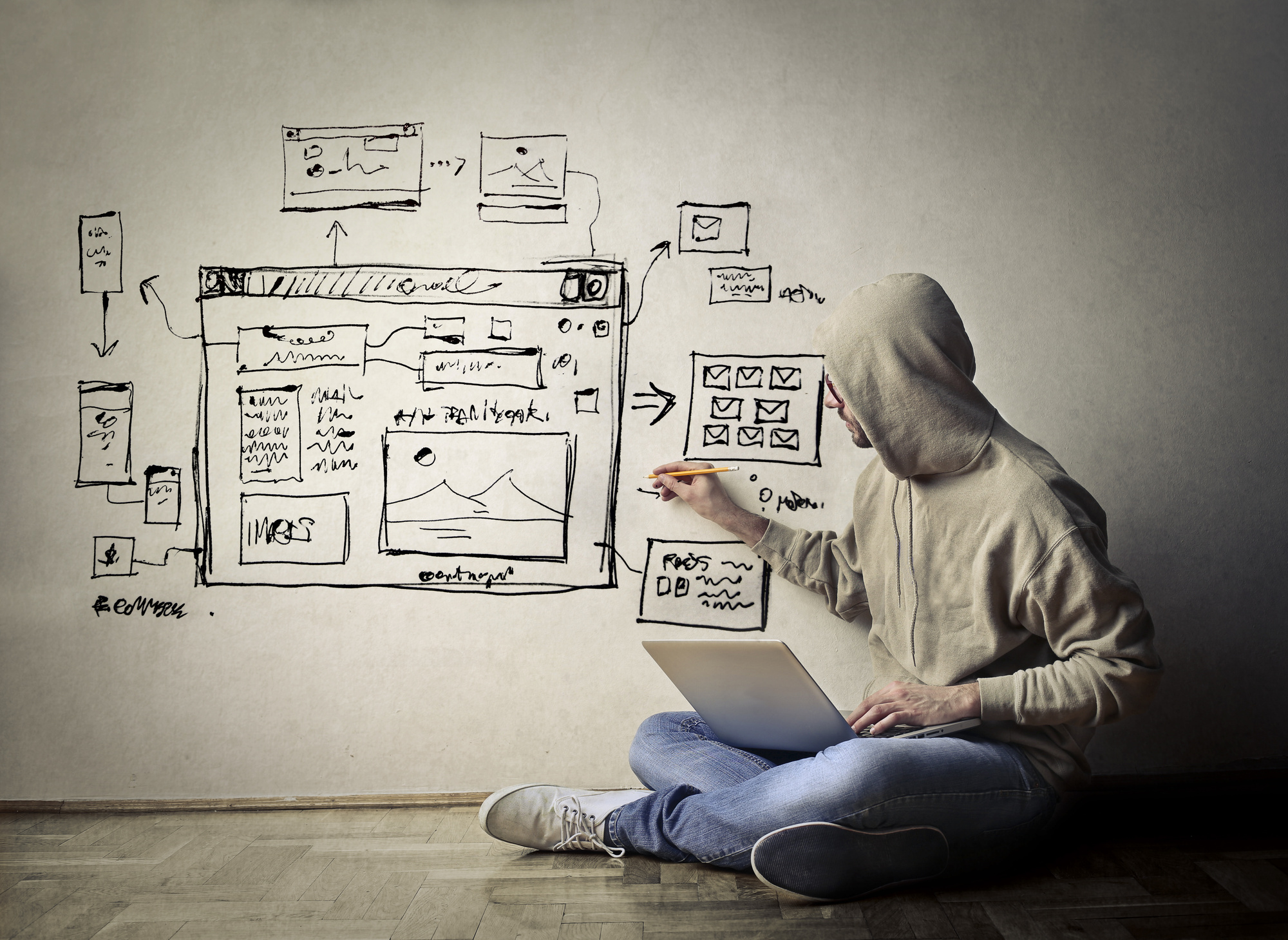
When it comes to web design, that couldn’t be truer. Good design is remembered because it feels magical. The user is transported to another world, a two-dimensional space that somehow transcends the computer screen to feel more real than it should.
One of these details? Your website’s buttons. Keep reading to learn about what’s hot in 2018 for cool button designs, and other web design trends we can’t get enough of.
Cool Button Designs
It may seem like there’s not much that can be improved in the way of button design, but that couldn’t be further from the truth. Buttons are one of the hottest design details for web design this year, so make sure you’re up to date on what’s trending in the button game.
Drop Shadows
Sure, drop shadows have been around for a while, but they’re being reinvigorated this year as a dynamic new design trend with a new twist. Parallax sites and innovative new grid designs have given shadows new spaces to play with, and that includes buttons.
The biggest element of shadow use in new button design: the use of bold gradients to create abstract two-dimensional buttons that feel three-dimensional. Gone are the days when a plain, black, true-to-shape shadow was enough for a button. Today, button shadows are colorful, varyingly opaque, and way more interesting.
The Pill Shape
They say that art imitates nature. That’s the idea behind the popular new button shape: the pill.
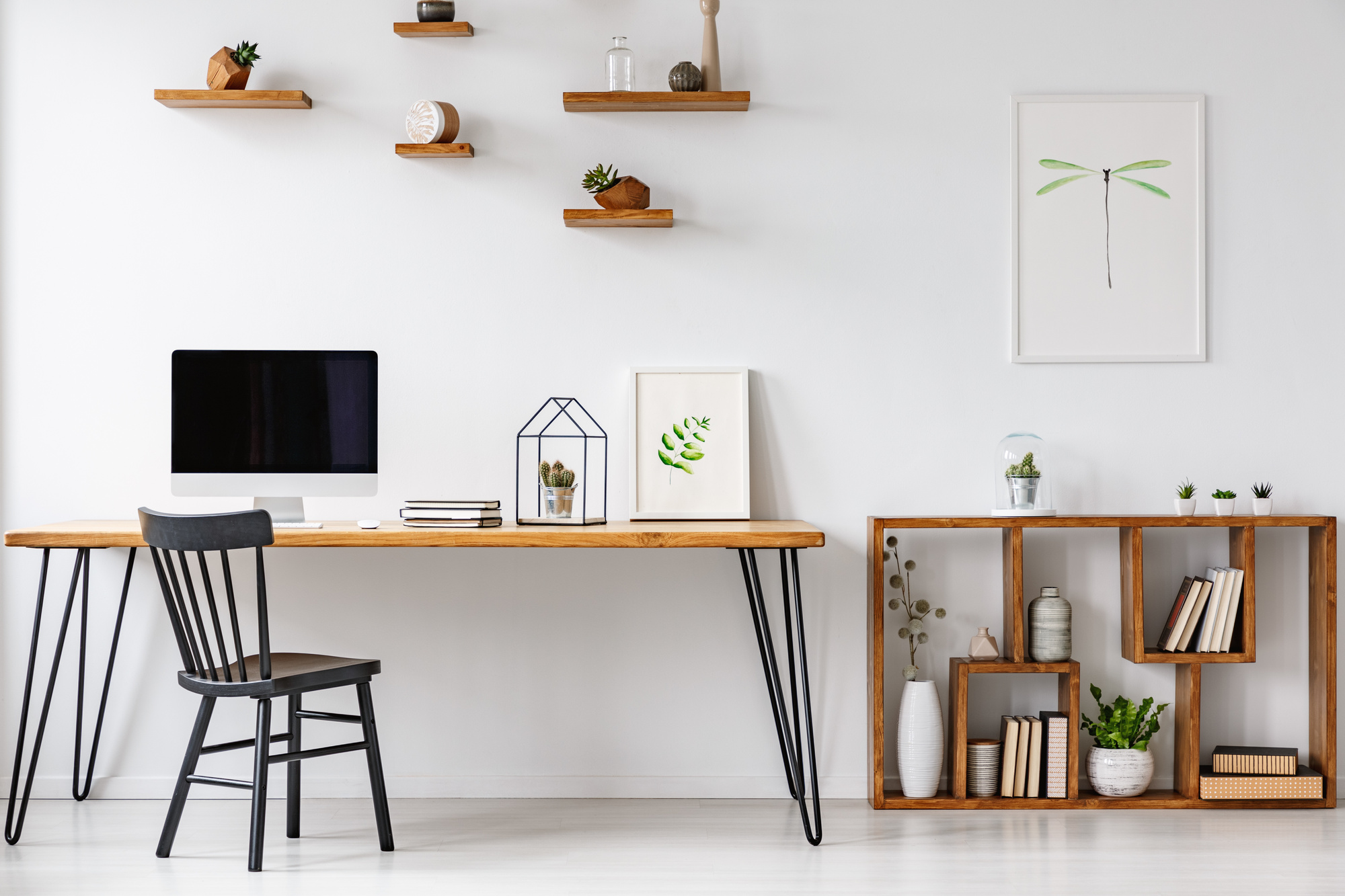
Square buttons feel outdated and uninspired compared to the soft edges that dominate web design today. Even the big dogs, like Facebook, round the edges of all their site cards.
Some modern sites still use square buttons to appear authoritative, but the pill shape improves user experience and makes your design flow more smoothly.
Bold Colors
Bold colors are big in 2018 with all web design, which means buttons need to follow suit. Why?
Because when a site’s color scheme is bold, buttons get lost in the mix. That’s the opposite of what you want for your actionable items. If your buttons don’t stand out, fewer of your site’s pages, features, and opt-ins are being clicked on.
Bold colors are for buttons that want to keep up.
Other Cutting Edge Design Trends
All web design trends inform each other, so it’s essential to become well-versed in everything going on in the web design world, not just buttons.
Bold Typography
Typography has become a design element in itself. That’s why designers are going big with their fonts this year.
A site’s typography used to have one purpose: to convey text. Now that typography design has blown up, however, it’s become a huge element in web design that can speak volumes about a site upon a visitor’s first interaction.
Pro tip: mixing serif and sans-serif fonts is cool now.
Broken Grid Layouts
Regular grid layouts became the glass ceiling of web design. And just like hardworking feminists across the country, web designers are shattering through it.
Broken grid layouts are visually interesting, and as long as they’re done right, can still make just as much sense as a standard grid layout. The key to doing it right: don’t ditch the grid. Instead, ignore it.
Using a grid will ensure that your broken grid layout still makes sense and adheres to rules of spatial awareness. After all, you don’t want the site to come out a total mess.
To create a successful broken grid layout, layer containers over bleed lines and traditional gridlines in accordance with what’s going on in the other parts of the page. That’s the only way to create a broken grid layout that’s still aesthetically pleasing and easy to navigate.
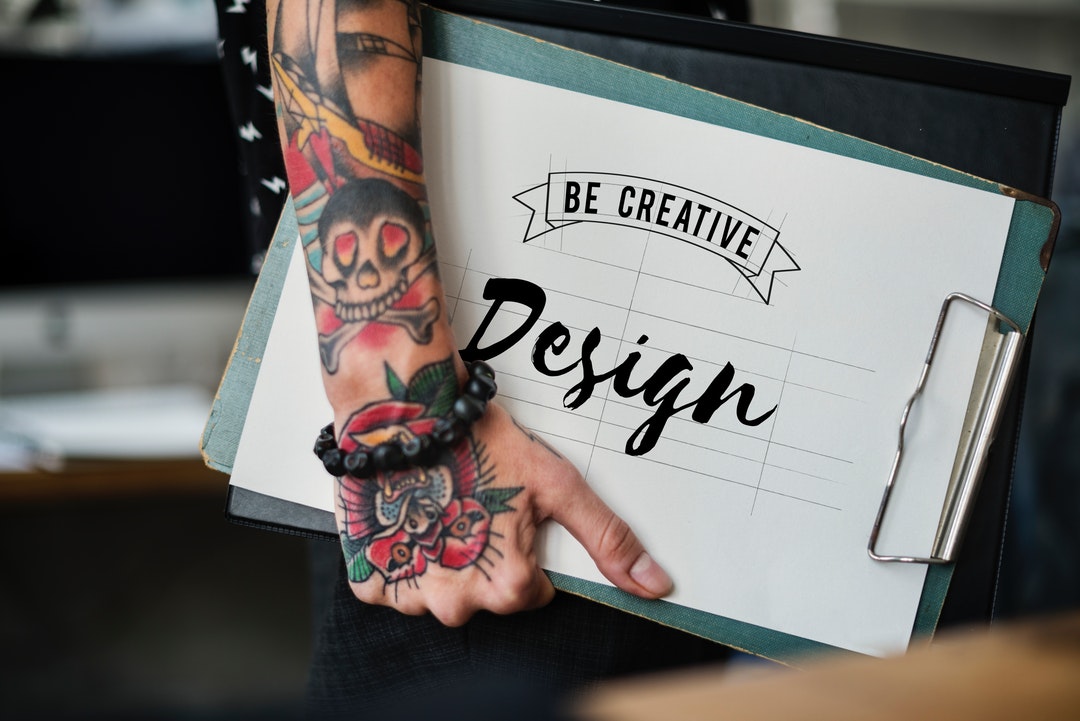
Illustrative Design
Quality images will always be a must in good web design, but the newest trend is illustrations.
Take a look at trending logos. Most new logos today are largely illustrative to keep up with design trends rooted in rustic sensibilities. Web design is no different.
The biggest power that illustrations have in web design is the power to inspire the analog in the digital. After all, it’s a flesh and blood person on the other side of the screen, and people have emotive reactions to handwritten text and images.
Harness the power of sentiment in your web design by including analog-inspired elements, like an illustration.
Defying All Expectations
Once minimalism was ushered in as trendy web design, maximalism followed. Going against the status quo will always turn heads, and help visitors remember your site long after they’ve clicked out.
The newest way to defy the status quo? Brutalism. It’s a web design trend that doesn’t take SEO or typical design sensibilities into account at all in favor of keeping to one extreme theme.
Check out the sites of designers Balenciaga and Gucci for prime examples of brutalism at its finest.
Details, Details, Details
Details are what create the magic, so adding little touches to a site’s almost-final design will set it apart.
One way to do that is to play with a site’s scrolling rate. Set a different scrolling rate for images than the page, like Anna Eshwood, to create a dynamic user experience that highlights expediency and gives a magical feeling.
Floating navigation menus are also a fun new design element that highlights cool background designs. Set your navigation bar to float below the true top of the page for a slightly broken-grid feel that looks innovative and highlights imagery. Check out Le Reseau’s site for an example.
Video and particle backgrounds are also hot when it comes to user experience. It doesn’t have to be a long video; a simple clip on a loop will do. Make sure the colors aren’t too oversaturated to maintain your site’s readability.
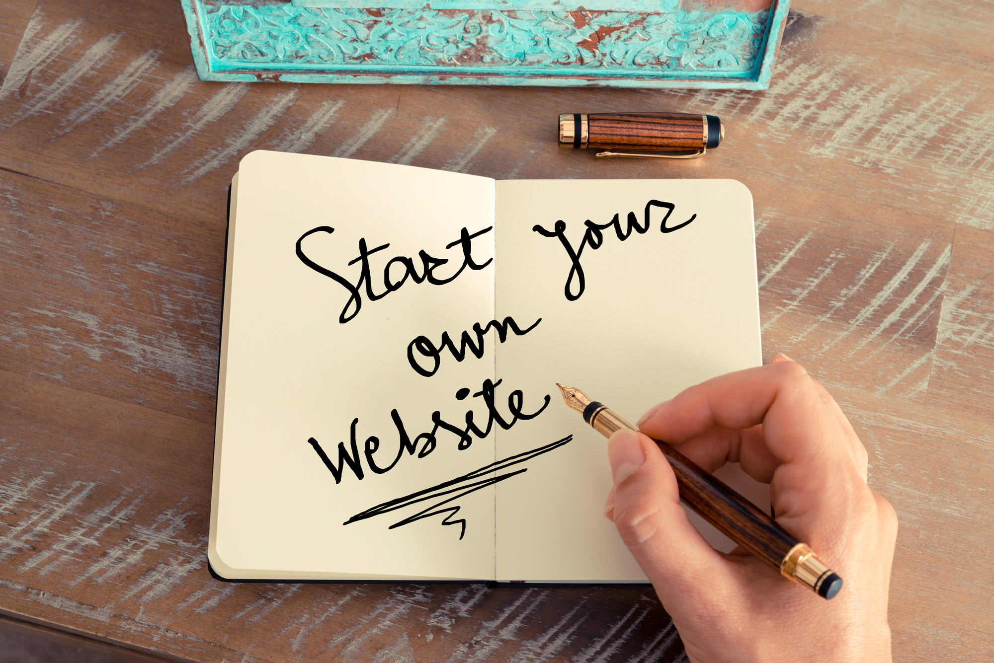
Your Web Design
Now that you’ve read up on the latest in cool button designs and other web design trends hot in 2018, take your newfound knowledge and get designing!
Want to learn more about what’s new in the design world? Check out our other web design tips for everything you need to know!