


There are many important elements that go into building an effective website. From coding to user interface, every part plays a role.
That’s true about colors, as well. The colors you use on your website have an impressive impact on your users
Color plays such a huge role in marketing, 90% of snap decisions on products are made because of its color. It’s also true for web design. A website visitor will make a judgment on your website in under 50 milliseconds on color alone.
When planning colorful designs for your site, it’s important to think about what kind of emotions they will evoke.
Follow along as we discuss the different colors and how you can use them in your site design.
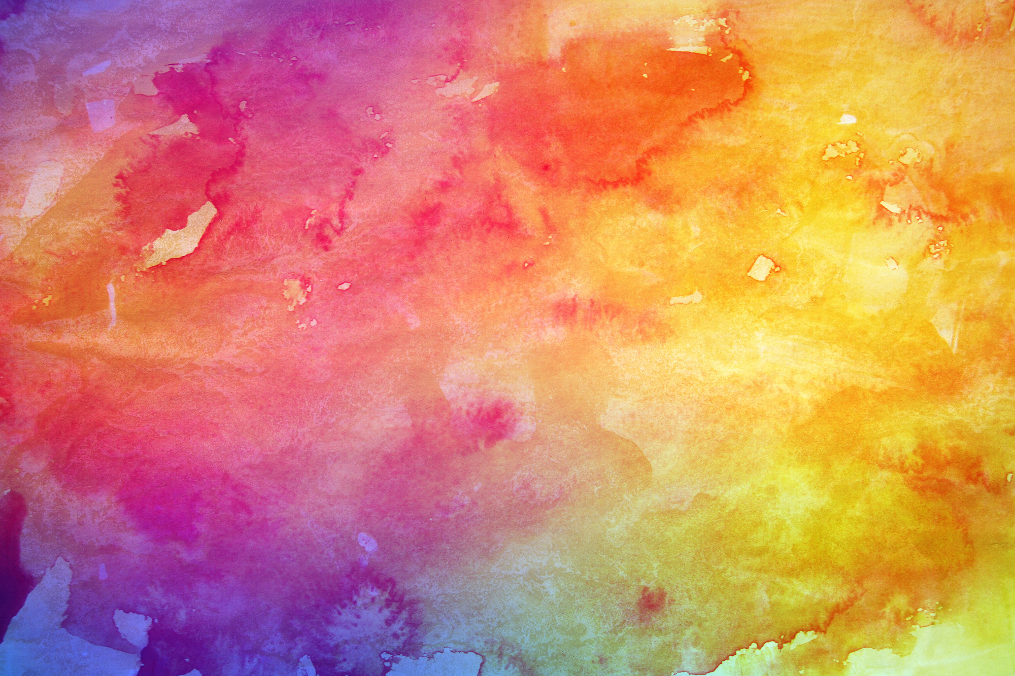
Color Theory
First, let’s talk about the basics of color theory. It’s important to understand your tools before you use them.
Primary colors are pure colors, meaning they’re not mixed with anything. These are red, yellow, and blue.
Secondary colors are two primary colors mixed together. For example, blue and yellow create green. Red and blue create purple. Red and yellow create orange.
The can be contrasting, meaning opposite, colors, like yellow and blue. Or they can be complementary colors, meaning in the same color family, Think of red, orange, and yellow as warm colors, blue, green, and purple as cool.
Beyond colors, there are “values”, shades we don’t see on the color spectrum. These are white, black, and grey.
Knowing where these hues come from and which ones work best together will help you create an effective website. Let’s go over what these colors mean to your site visitors.
Attention-Grabbing Red
The color red has many strong connotations. This bold color evokes strength, passion, warmth, and excitement.
A website with red design makes viewers stop everything and pay attention. That being said, red can also be used sparingly. Think of an all black or white page with only a bit of red. Your eyes will be immediately drawn there.
Playful Yellow
Yellow is seen as a bright, happy color. Like red, yellow is exciting, but it also carries with it the promise of good things.
Colorful designs that use yellow will instill joy and adventure in the viewers. Use it to motivate your site visitor towards a goal.
Cool Blue
Blue is a serious and serene color. It relaxes your viewers and makes you seem trustworthy and reliable.
Blue is calming and yet buoyant, like the ocean. It’s not as exciting as red and yellow but still encourages your visitors to move forward.
Think of using blue to underscore your dependability and authority.
Go-Getter Green
The natural world is filled with the color green. As such, it’s seen as almost a background color.
That doesn’t mean it’s boring! Green is reassuring, saying “you’re in a good place”. It helps your viewers feel comfortable enough to take action.
Green gives off a sense of self-control and renewal. Use the color green especially on health and fitness websites
Royal Purple
Purple draws from the excitement of red and the serenity of blue. It gives off a royal and almost mystical vibe.
Purple is perfect for exploring creative or eccentric insights. Artistic websites, sites for fantasy books, or even personal bio websites would benefit from a pop of purple.
Outrageous Orange
Yellow’s positive vibes and red’s strength combine in orange, creating a fun, inviting color.
Colorful designs with orange in it evoke a sense of playfulness. Orange is an adventure waiting to happen.
Just like with red, a little goes a long way. Too much can cause orange overload.
Use a little bit of orange to make your design pop or to guide your visitors from page to page
White Out
Moving onto the values, white is a serene, peaceful color. Sites that utilize the color white seem refreshing, a blank slate onto which users project their ideas.
A minimalist site benefits from a fresh, clean white scheme. Just be sure that your site looks finished and not left undone.
Luxurious Black
Much like white, black is itself almost a clean slate. The difference is that while white feels light and airy, black feels serious, luxurious, and sophistication.
Black is a very strong color. Unlike more colorful designs, black seems solid and infinite. Prepare to make a powerful statement if you use black in your design.
Serious Gray
Gray is a brainy color. It carries with it implications of sleek technology, authoritative intellect, and dependability.
Gray can also come off as neutral, not leaning in a direction one way or another. Other attention grabbing colors make an instant impact on a viewer.
Gray can be a constant, calming presence. Tech sites or medical sites look great with touches of gray.
Cultural Color
Colors play different roles around the world. Keep this in mind when designing a website for an overseas customer.
For example, the color yellow connotes sadness in Greece. The color white is used for mourning and funerals in China.
Red is a common wedding color in Asia but carries with it connotations of communism in former soviet countries.
Do your research when designing for customers from around the world.
Pop Colors
Colors also ebb and flow in popularity in pop culture.
Take so-called “millennial pink” for example. This beautiful blush color has popped up everywhere, defining a generation and crossing gender lines.
Minimalism is also having a moment. Neutral and muted hues on white expanses are great examples of this trend.
Pay attention to color trends when you’re designing your site.
Start Creating Colorful Designs
Color is a beautiful thing and now you’ve got some great ideas as to how to use it effectively in your designs.
Your sites will have much more reach and impact once you master the basics of colorful designs.
Looking for more inspiration? We update our site all the time with tips, tricks, and resources for graphic designers.
Stay on the cutting edge of web design. Explore our site and check back often for the latest info on design trends!