

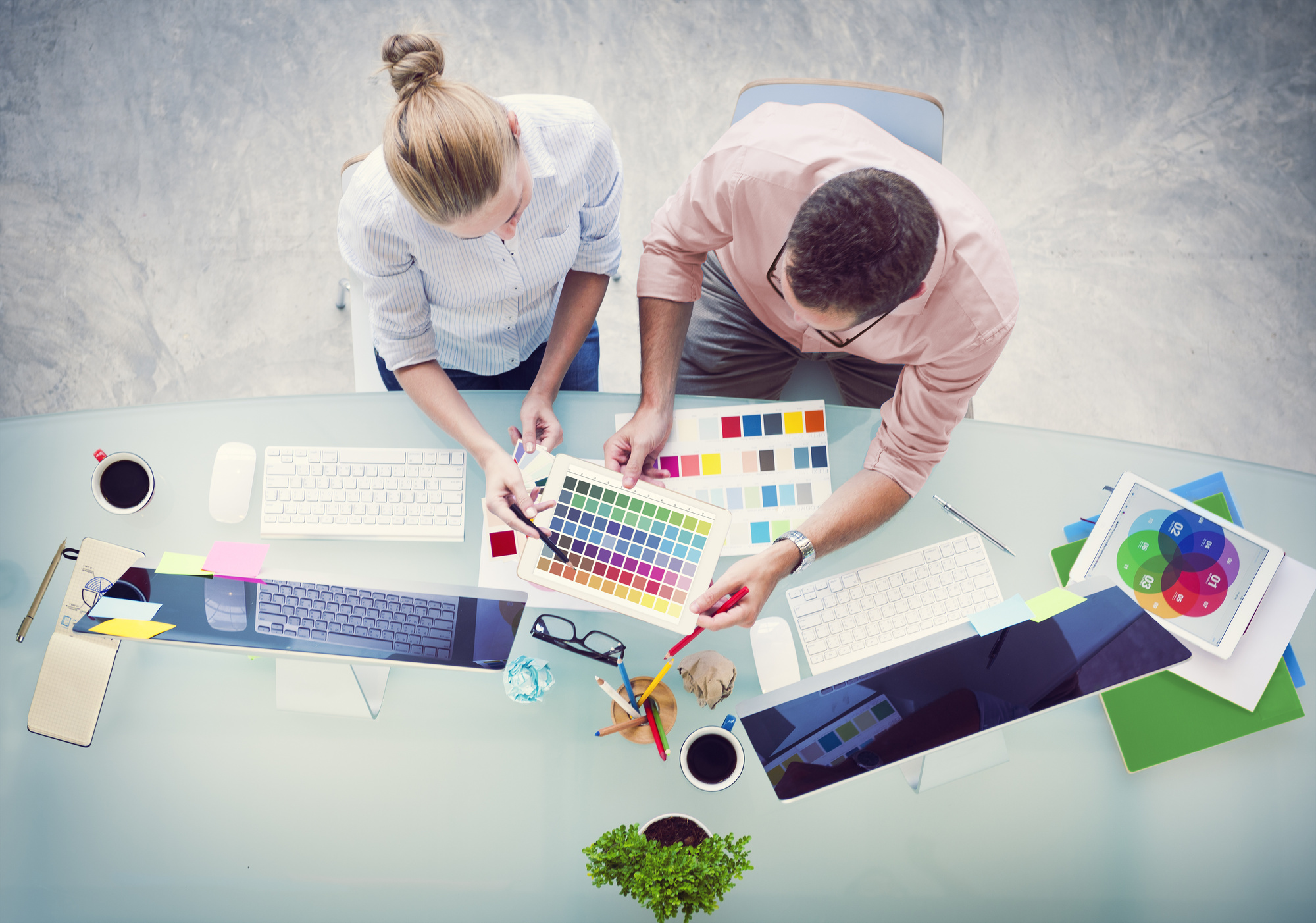
WordPress is one of the best, and most popular, web design platforms out there. Inexperienced designers can use templates and plugins to make their site standout. And, those with more robust coding experience can custom-build every aspect of a site.
In 2018, web design is reaching all new heights. Virtual reality and a new text editor called Gutenberg are only two of the hot new creative website design trends coming to WordPress in 2018. Read on to learn about eight more.
1. New Minimalism
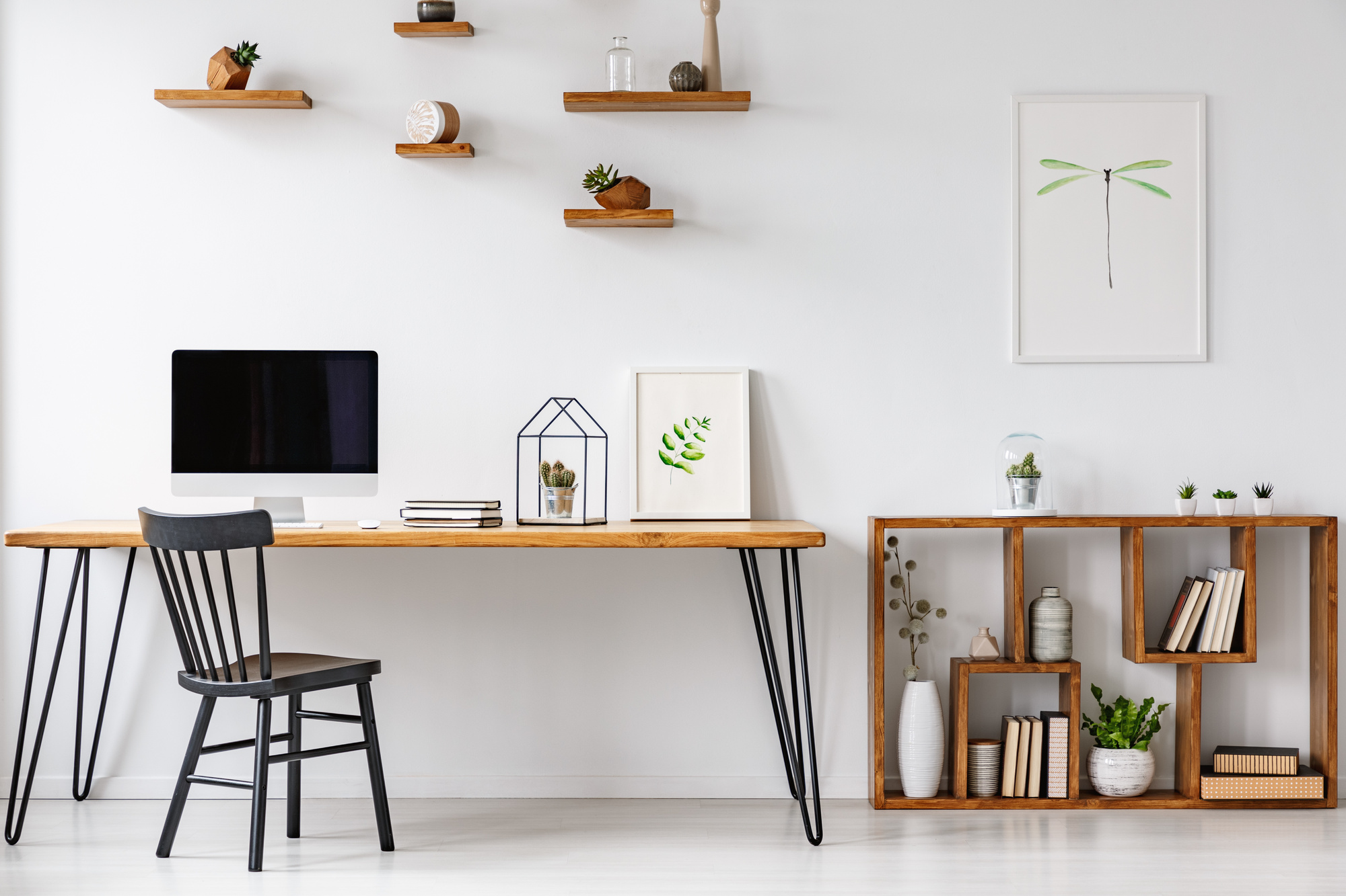
Minimalism has been a big movement in website design for the past few years. Clean spaces, simple fonts, and lots of breathing room have been increasingly popular for modern web design. Now, that minimalism is still around, but it’s starting to evolve.
Some of the best website designs are starting to use gradients and shaded images to deepen their minimalist designs. Placing an image at 20 to 30 percent opacity behind a colored wash can keep your website simple while adding beautiful interest to the page. The key is to leave plenty of white space on the rest of the page.
2. Vibrant Colors
Speaking of colors, vibrant, saturated colors are starting to be more popular in modern web design. Color psychology is a huge part of any successful design, and modern web design is leaning into that idea. Bold, brilliant colors can bring a website to life and help create the feel you want for your design.
Don’t be afraid to use full-screen images that use rich, saturated hues. In smaller images, you may want to use contrasting colors to really make images pop. The right use of color in a design can create a wonderful energy for a site.
3. Broken Layouts
Current web design trends are all about breaking the rules. Older web design stuck to a fairly rigid grid – text in this column, images in this one. But modern web designs are starting to break out of those grids and create wonderful unexpected movement in their layouts.
Try using large, blocky images overlapping one another and breaking into text space. Have headers for pages run up the side of the page rather than across the top. Experiment and don’t be afraid to break a few rules – and lines – in the process.
4. Diagonal Layouts
The broken grid theme is actually going one step further in 2018. Rather than using vertical and horizontal lines to delineate different sections of a page, current web designs are beginning to use diagonal lines. This can create a very interesting sense of movement and keep the viewer pleasantly off-balance.
New WordPress themes allow users to create diagonal dividing lines. Try having a transition from one block of color to another run along a diagonal and watch how much less rigid your site appears. You can also use diagonally-focused images to add more subtle diagonals to your design.
5. Large Fonts
In 2018, web design is all about the big and the bold, and fonts are no exception. Gone are the days of the 36 pt. headers on every page. Now, a header may take up the whole screen. After all, if the message is important (and beautiful) enough, why keep it small?
The trick with large fonts is not to overwhelm viewers. Make sure your header is either a solid color or two adjoining colors on the color wheel. Unless you’re looking to jar your viewers — in which case, go nuts with colors and font!
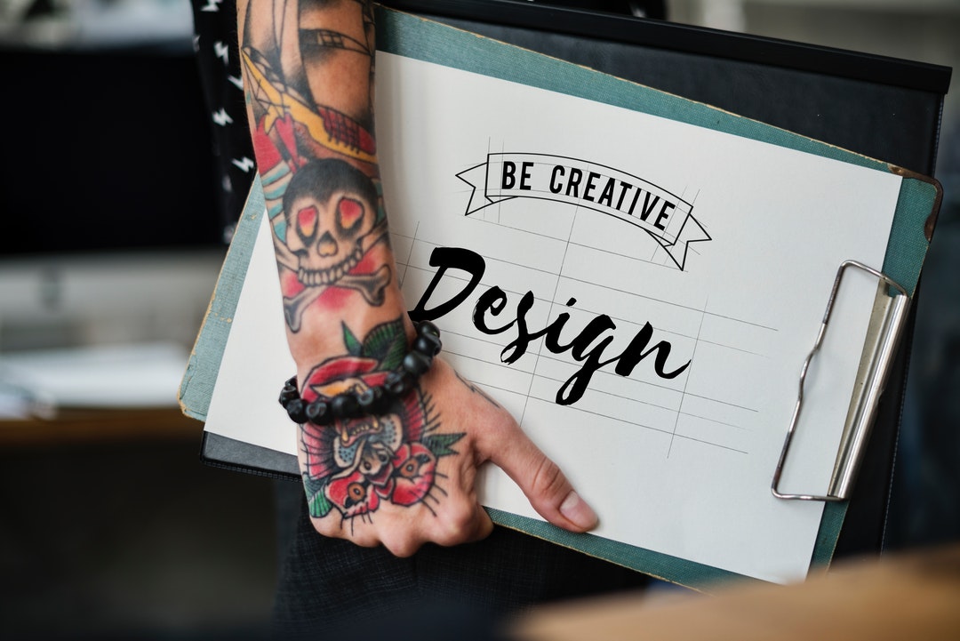
6. Customized Illustrations
Bitmoji and other apps have made customizing imagery a tool that is quite literally at our fingertips. Your website should be as unique as your business, and customized illustrations are a great way to accomplish that.
The first thing you’ll want to do is find a talented illustrator whose style matches the look you want for your site. You’re going to need to set aside some budget to pay them for their work, but the money will be well-spent. Your site will be absolutely unique, and much better suited to broadcast the message you want.
7. Microinteractions
If you’ve “reacted” to a post on Facebook in the past few months, you’ve encountered a microinteraction. These happen when a website viewer hovers their mouse over a specific component of a web page and something special happens – usually a small animation. Microinteractions can be a fantastic way to keep viewers engaging with your site.
Microinteractions can include anything from a menu option moving over, bouncing, or shading a different color when hovered over, to a button on your page emitting fireworks when clicked. Think about the aesthetic you want to create on your site, and design your microinteractions around that feel. For instance, a more business-like site might want smooth, gliding animations where a more exuberant site might have bouncing or confetti.
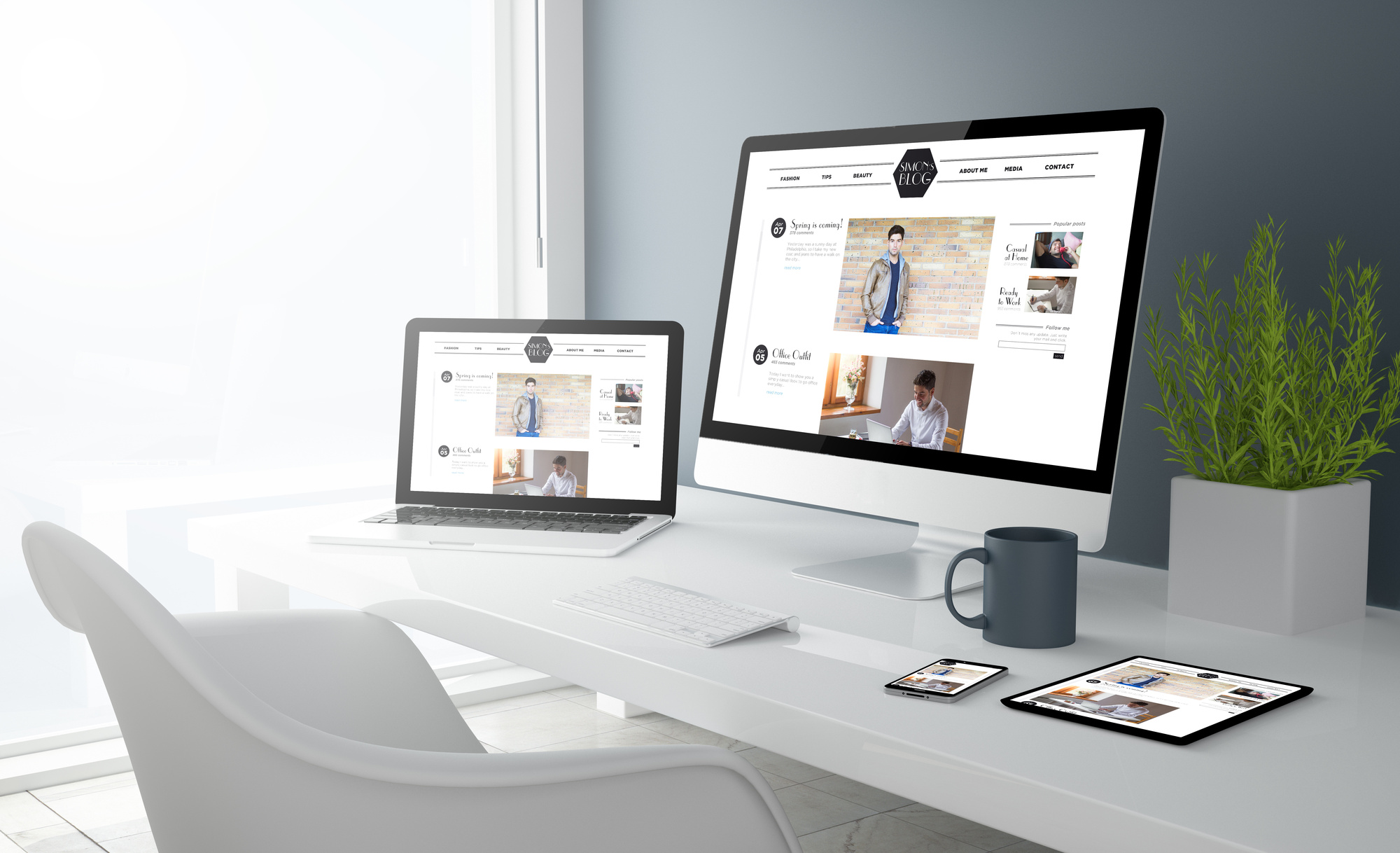
8. Mobile-Friendly Design
The world is moving more toward mobile communication, and that trend is unlikely to stop anytime soon. Web design needs to keep up, meaning that having a mobile-friendly design is crucial to modern websites. There are a few things you want to keep in mind when creating a mobile-friendly design.
You’ll need to make sure that both your text and graphics on your site resize to fit whatever screen the viewer may be using. There are a few WordPress plugins that will automatically take care of this process for you. Before you launch your site, however, make sure to preview the site on mobile and contact an expert for help if things don’t look like you want them to (click here for more info).
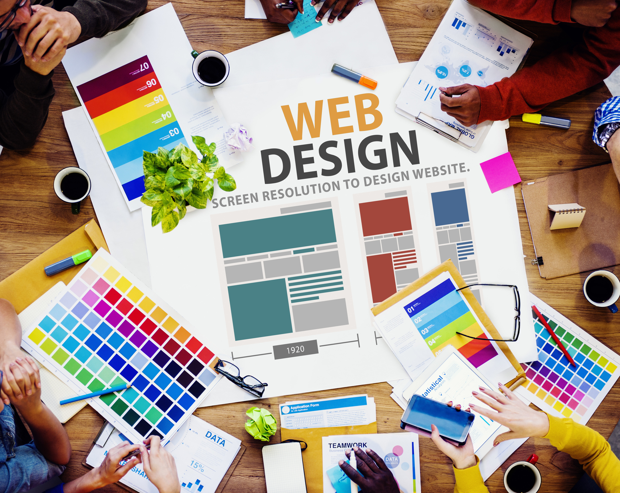
More Creative Website Design Tips
Creating the perfect website can be a challenge, but with all the new tools that are available, the options for creative website design are myriad. Make sure to hire an expert designer, and keep an eye on the latest web design trends and you’ll have a beautiful website.
If you’re looking for more web design inspiration, visit the rest of our site at DesignsDesk. We have resources for new and advanced designers covering web design tips and graphic design ideas. Contact us today with any questions you need to be answered about excellent web design.