


In the current era, having a mobile-friendly website is an absolute necessity. Mobile internet browsers finally overtook desktop browsers back in 2015. The amount of smartphone visitors you’ll have to your site is likely only to increase and increase.
If you’ve ever been routed to a site on your phone without a mobile version, you’re likely familiar with the frustration that some mobile users feel. Google has already begun to give preference to mobile-functioning sites in their search results, with other search engines following suit. Simply stated, you could lose more than half your audience if you don’t have a mobile version of the website.
If you’re looking to how to make a site mobile friendly, you may be relieved to hear that it can be a quick and straightforward process. There are actually many easy ways to make your website mobile friendly– read on and find them below.
What Is A Mobile Friendly Website, Anyway?
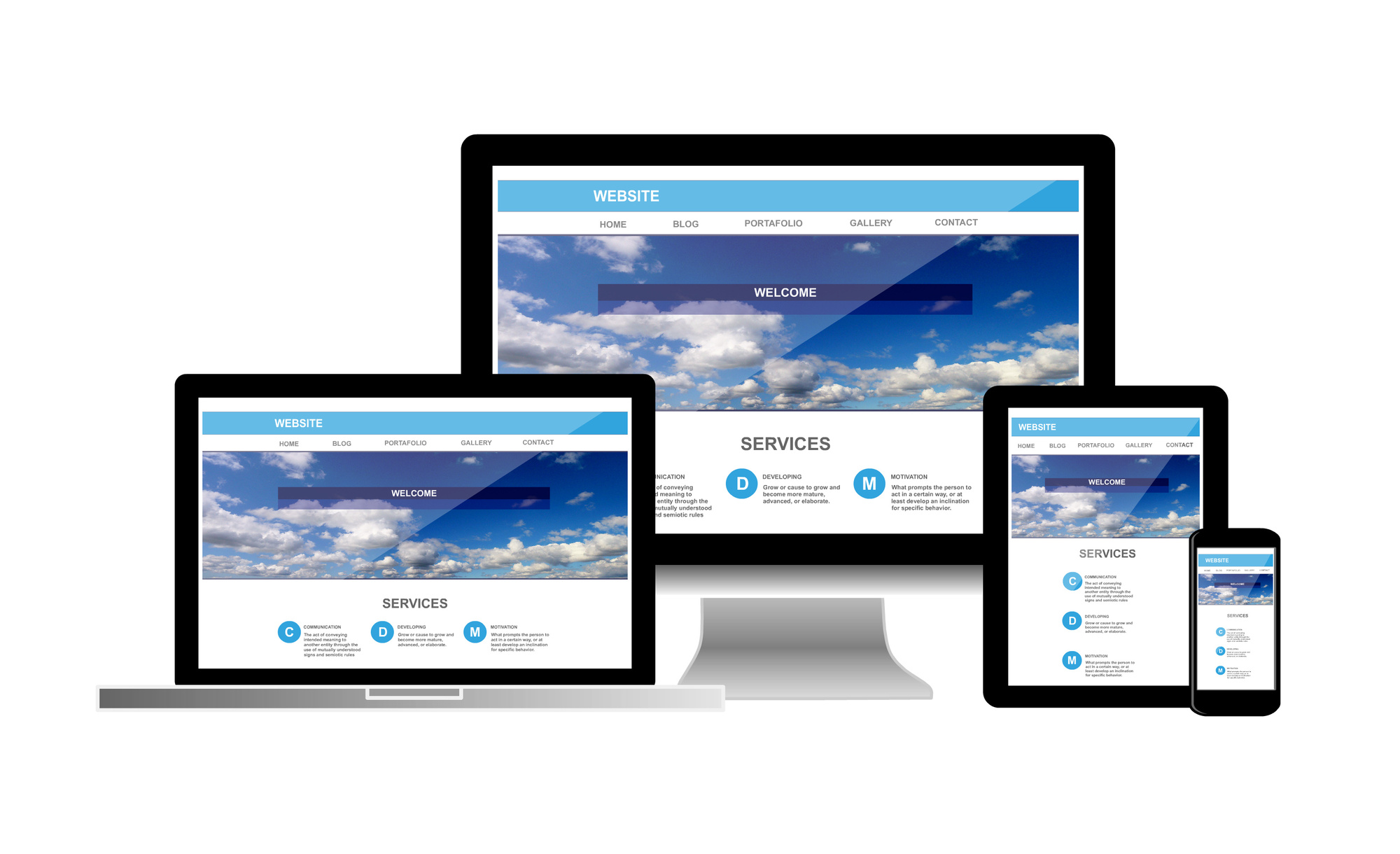
Having a mobile-friendly website means there’s a version of your site that displays more easily on a phone or tablet device. This means that the amount of content displayed on your page, the space and size of buttons, even the shape of the website is changed from the desktop version.
A mobile-friendly site will also typically feature more touch-friendly elements for optimization by touchscreen devices.
These design changes are intended to help mobile viewers find what they’re looking for within seconds. Not only this, but a mobile-friendly version will help your website load much faster on phones and tablet devices.
Many business owners employ a mobile-first philosophy when designing their sites. This means that the design and launch of the mobile site are done prior to the desktop version.
If you haven’t yet launched any version of your site, you may want to employ this methodology. If you can manage to make your site will work on a mobile device, it should be easy to translate this success to a desktop.
If your site already exists in a desktop version, there are still some easy optimization options you can explore.
Google Mobile Optimizer
One of the quickest and easiest tools on the web for mobile optimization is the little tool made by Google. The Google Mobile Optimizer will first check to see if a mobile version of your website exists. If it doesn’t, it will scan your site and present to you a mobile-optimized version of your site, with the same elements resized and rearranged for better viewing.
Google’s tool renders a completely non-customizable site, so it’s not recommended for those looking to create something polished and precise. But if you need a quick cover site while you work on something better, there’s little on the web faster and easier than Google’s impressive tool.
Check Your Web Builder
You may have built your current site on a popular CMS website such as WordPress, Drupal, Joomla, or one of the many other options available online. If you did, there may be a built-in feature that allows for mobile optimization.
WordPress, for example, has a plug-in known as WPTouch that can help add a custom mobile experience. WPTouch, and many plug-ins like it, also offer additional features and services specially designed for mobile websites and e-commerce stores. Checking System information and settings on these CMS sites can help you pick a theme that is mobile-friendly and responsive.
If you’ve built your website through other web development providers, you should check their settings. Mobile optimization may be part of what they offer. Many popular website builders such as SquareSpace or Wix allow for easy mobile optimization. They employ a simple drag and drop workflow that means you won’t have to write even a single line of code.
The downside to these site builders, however, is that their popularity far outreaches the creativity and variety of their designs. This means you might end up with a site that looks and feels exactly like many others built in the same web builder. That would be less preferable than one that stands out from the crowd.
Responsive Website Design
Responsive web design is one of the key ways in how to make a site mobile friendly. It means designing your website in a way that it can display properly on and adapt to a variety of mobile devices.
In this way, it goes hand in hand with a mobile-first methodology. The questions you will need to ask yourself include– what content is priority to go on the mobile site? If something isn’t vital to the mobile site, does it still have enough worth to be on the desktop version?
Responsive design creates the best mobile version of the site and then increases sophistication and functionality as the screen size grows.
Your website should open and automatically adjust to the dimensions and resolution of the device it was accessed on. This is done through the Cascading Style Sheets or CSS for short. Different browsers will render a page with a separate set of CSS instructions.
Testing Your New Mobile Version of Website
After you’ve updated your site to a new theme, attempt to visit it on both mobile and desktop devices to test out your changes. The best way to test the mobile-friendliness of your site is to simply visit it yourself and navigate around. Analyze your feelings– is it an easy, enjoyable experience? Are things easy to click and find?
If you want an objective opinion, you can always turn to Google’s Page Speed Insight tool. The Insight tool will look at your website and test it’s performance across a variety of devices, giving you an objective sense of the quality of your chosen theme.
If your site checks out on your personal run-through and with Google– congrats! You’ve officially made yourself and your business mobile optimized.
Living In A Mobile World
It’s indisputable that in today’s world, having a mobile-friendly website is a complete necessity. With the proper responsive website in hand, you’re much more likely to bring satisfied customers to your page.
Have you made a mobile version of your website for various devices? Let us know in the comments below. And as always, keep checking back with us for tips and tricks to make your website design the best it can be.