


Planning to make a site for your business?
It should come as no surprise. The internet expands at a much faster rate than it ever has in the past decade.
In 2017, there are about 1.76 billion websites around, and it’s expected to reach around 2 billion by 2019. While 75% of these are inactive, it goes without saying that the remaining 25% still means hundreds of millions of websites.
Most of these websites rely on CSS, with about 95% of them using it to facilitate their minimalist design features. But like everything else, Cascading Style Sheets continues to evolve and get new features.
But what are the newest features you can use for your website? Let’s find out.
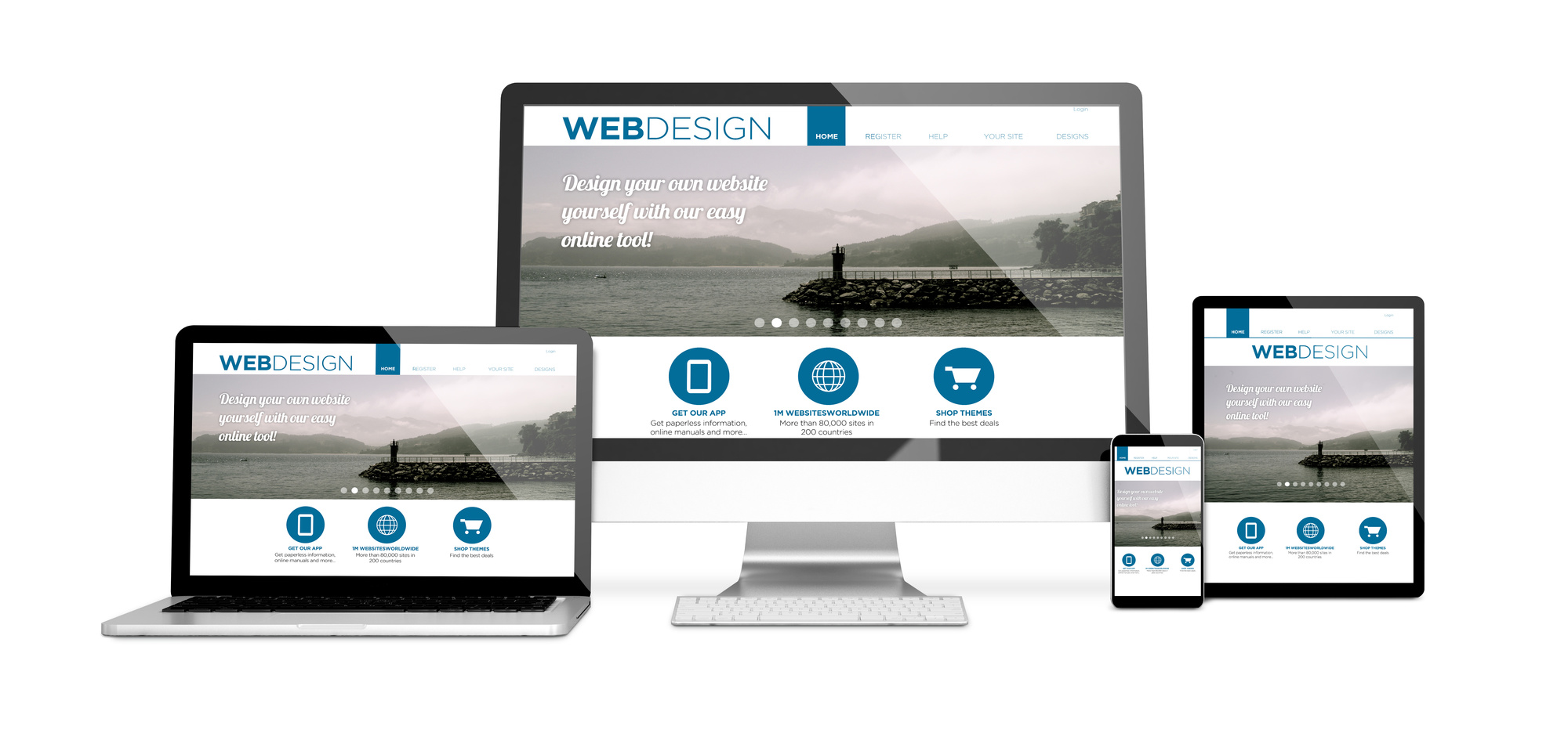
1. Mobile-Friendly Grids
With the growth of smart mobile devices these days, having a responsive layout is no longer an option. If you want your website to get more exposure, you need to make it as mobile-friendly as possible. This is possible with the use of CSS because you can toggle it using a simple keyword.
With the use of the flexible length unit (noted as fr)in CSS, you can give the browser the instructions needed to break the space. It allocates the areas to the columns depending on the multiple of the fr. It’s easy to implement especially if you make a layout with columns of equal length.
2. Grid Width Manipulation
Back in the old CSS, the base layout was difficult to tweak due to the math and computation involved to arrive at the right column width. But the great thing about the new CSS grid, you can now set the width of the grid and the required columns on the grid layout without hassle. Some experts find it simplified in such a manner that it’s as easy as data entry processes.
The flexibility of this new feature allows you to make grids with varying widths as well as grids based on height. A good example of this is to create a grid layout containing columns that use the fr multiple to enact its unequal widths. This allows you to have good CSS design patterns by maintaining its sense of proportions without having equal measurements.
In addition to this, using viewport units, CSS Calc, and CSS Grid allows you to make the grids based on the website’s height. As most veteran coders know, this was impossible before these new features changed the way you implement website designs.
3. Grid Item Placement Manipulation
When it comes to attaining the optimal positioning of the items in the grid, developers had a lot of trouble calculating it. That meant most developers avoided dealing with it, making a lot of websites look bland and standardized compared to those that did. With the use of CSS grid, these troubling mathematical computations are now easier.
After all, you only need a simple keyword to specify the location of the item relative to the grid. For example, the grid-column keyword makes an item appear on the column you specify. If you put 3 on it, the grid item will appear at the third column.
4. CSS Shapes
Before, most website layouts had a rectangular design. Some of the more innovative and daring developers tried experimenting with irregular shapes, like triangles and circles. Most developers opted for convenience because it’s hard to implement and the concept itself seemed alien and unorthodox.
But with the use of the clip-path keyword, it’s now possible to make irregular shapes when coupled with the CSS shapes. It doesn’t need as much effort as it used to, allowing developers to make their own unique design styles. It’s worth noting that regarding intuitiveness, the CSS grid trumps the CSS shapes.
If you’re a website developer who needs a great means of making irregular shapes that integrates into your design, CSS shapes are the best for you.
5. CSS Writing Mode and Text Flow
Not all languages use the left to right flow when writing sentences and content. However, due to the prominence of English-speaking users on the internet, we see words flow this way. But if you want to give people more means of feeling at ease when it comes to reading the text, there is a way to make words flow from other areas.
For example, when the reader is Chinese, it’s natural for them to read the words from top to bottom. Arabic people read their sentences from right to left. Changing the text flow isn’t easy to manage before.
But with the CSS writing mode feature, you can now change the way the text flows without disrupting your website design. It flows in such a way that it’s almost the same as the one used in the reader’s native language. It provides convenience and gives off an impression that your website cares for its visitors, giving you an effective means of reaching a wider audience regardless of their location or language.
Another great benefit of using this CSS feature is that you can rotate text in different degrees. It allows you to create an awesome and unique layout. It becomes essential when you want to try an Avant-garde approach to your website and make it reflect your artistic sense.
Get Good Design Features Today!
The new CSS features helped developers with accomplishing their tasks in more creative ways.
Some of these changed the way you make websites, as you can give design features that were seemingly impossible before. If you don’t have any experience when it comes to web design, now is the best time to start learning since it’s easier and more convenient now with CSS around.
If you need more CSS news, you can read this related article about the ten essential tips for CSS beginners. It will help you start off with your learning, and it can help you develop the best practices out there that ensure you code neatly and efficiently. It makes you more desirable and helps you start off with your web design career.