


At last count, there were an estimated 1,907,289,370 websites online. That massive number means massive competition online.
So how then can you design impressive websites for yourself or for your clients that can cut through that massive clutter and help not only attract users but get them to take actions that lead to sales?
While there are a lot of answers to that question, one of the simplest is leveraging clean website design.
Clean website design is an umbrella term that encompasses the use of sound graphic design principals to reduce consumer confusion, crush website bounce rates, and drive focus to the most important elements on a page.
Below, we go over some actionable tips and advice on how you can start leveraging clean website design now.
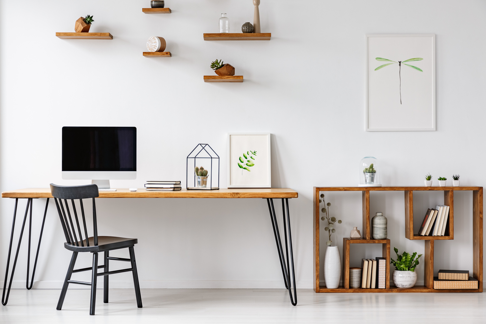
1. Keep Your Homepage Minimalist
There’s a bad movement going around in the web design profession right now where people are not putting any focus on their home pages anymore. They do this because they feel most users now enter their site through sub-pages they find in search engines.
Falling prey to that trend is a massive mistake.
Your home page is still a big piece of your branding puzzle and an unprofessional, ineffective one can turn consumers off and cost you money.
To get the most out of your homepage through clean website design, keep your messaging simple, your text big, and everything very visual.
Understand what action you want a user to take and create a big visible button to help them do it quickly.
2. Make Your Content Easy to Read
Writing for the web is different than writing for books. People online have short attention spans. They want to be able to scan over information at a glance, know what you’re all about and understand how they can take their relationship with you further.
In order to help them do exactly that, you’re going to want to use colors that contrast to make typefaces legible. You’re going to want to leverage bulleted lists instead of lengthy paragraphs. You’re going to want to break up your points with clear headings and subheadings.
If all of those “wants” have you a little confused, the best resource online for learning how to format web content is the Yahoo Style Guide. It’s definitely worth checking out.
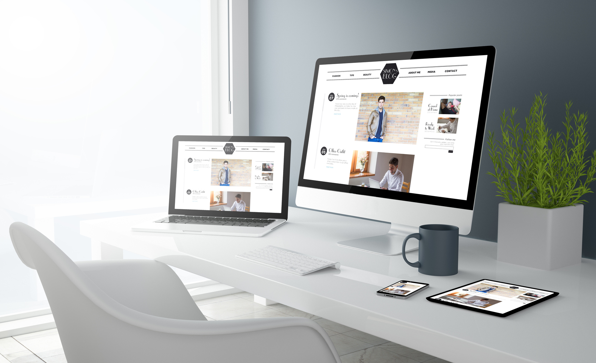
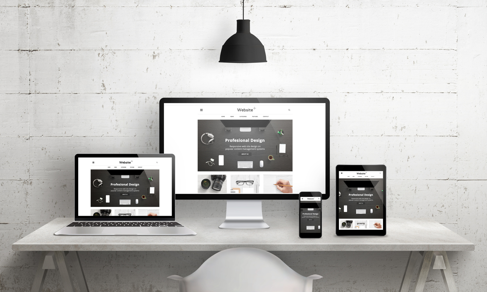
3. Your Desktop and Mobile Experience Should be Equal
Clean website design means creating seamless experiences for consumers no matter what device they’re consuming your content on. To that end, you need to move away from having all of your site’s features available for desktop but just a handful of them available for mobile.
Your design should feel very similar on every platform visitors come from and functionality should be 100% equal.
If you do that, you won’t ever limit a prospective customer from interacting with your products and services. That will open your site’s potential up to attracting more sales.
4. Worship White Space
People love white space. It allows them to visually separate information on pages and never become overwhelmed with the content they’re facing at a glance.
White space should be present in multiple facets of your site.
Your blog, for example, should never have paragraphs bigger than three sentences long. If you have a lot of information to present consumers with, your site should be broken up into a main column/side column structure which will help parse information out in a way that doesn’t pull user’s focus unnecessarily.
At the end of the day, clutter is one of your biggest enemies when it comes to clean website design. If you suspect that it’s infecting sections of your website, lean on white space to mop things up!
5. Get Reasonably Creative with Typography
A lot of the clean website design points we have given you have been based in creating simple experiences for users. That may have created a spark in your mind that told you your typefaces should be as basic as possible.
While that’s a good instinct, know that there’s room for compromise.
Generic typefaces like “Times New Roman” or “Helvetica” can seem so familiar to web users that it leads to them losing their focus faster! For that reason, consider using a more unique legible font for your body paragraphs and adding a dash of extra creativity into your H1 and H2 tags.
Little traces of uniqueness can grab people’s focus just enough for you to let them know the value of your website and its products can bring to their lives.
6. If You Don’t Have Much to Say, Consider a Single Page Design
If your website isn’t very extensive then it can be a mistake to break up small amounts of information into multiple subpages. This could create the feeling that your website is half done or that it isn’t being actively managed.
To fill things out better, websites that are light on content should move to a single page design.
Single page designs lay out all of a website’s content on a single home page. This home page can be navigated via scrolling or by clicking on menu buttons which will automatically scroll users to relevant sections.
With a single page design, you can create an easy to navigate experience out of a little bit of content and do so in a way that feels clean and modern.
Wrapping Up The Ultimate Guide to Clean Website Design
Clean website design isn’t complicated. As a matter of fact, it’s anything but.
That’s why if you just incorporate the 6 tips above into your existing and future web projects, you’ll find that your site will be more visually pleasing, will appease more clients and of course, will be stickier when it comes to capturing consumers!
If you’re interested in learning more about the latest in web design, graphic design and more, our team at DesignsDesk can help.
DesignsDesk is a site created by designers for designers. To that end, you can expect to take your passion and/or career in design to new heights but regularly checking in with our content!