


If your email marketing is letting you down, you need some quick answers.
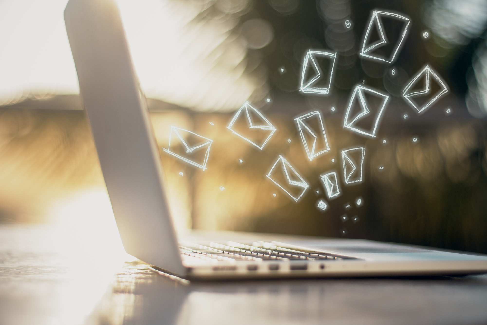
246 billion. That’s how many emails we can expect to send and receive globally in 2019.
How do you get noticed in a sea of similar marketing emails? It’s simple: be the one that gets it right.
Here’s our quick and snappy tutorial for email newsletter design.
Subject to Interest
Fail the subject and you’ll fail the whole newsletter.
How many emails do you receive a day? How many go unread? The two numbers are often similar.
You need a subject line that tells your readers that THIS newsletter is unmissable. Out of all their dozens of emails, this one is the real deal.
Appeal to emotions. Hit them with a hard question.
Address them by name. All these tactics will help your email stand out.
And never ever entitle your email with the ridiculous dullness that is “Marketing Newsletter” or similar.
A Thousand Words
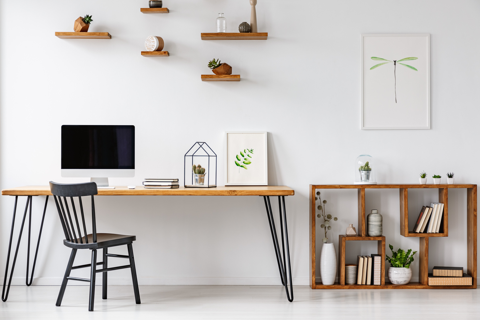
Strong images paint a strong picture. Humans are visual creatures.
Images land with us in a way that text can’t capture.
That’s not to say that text doesn’t have its place. It’s only to emphasize how vital it is to choose the right images.
Your images should accompany and reinforce your text. Skip the generic and hone in on something that really pops from the page.
Tap into powerful emotions like love or powerful sensations like hunger to make your images count.
Color Scheming
The human love of visual fanciness isn’t limited to images. Building a color scheme into your newsletter will help, too.
Your color scheme can do a few things, such as:
- Identify your brand
- Build a mood
- Control focus
A confusing mishmash of colors will achieve the opposite. They’ll make your newsletter unattractive – which is a short path to the junk folder.
Basic graphic design advice applies here.
Visual newsletter design forms a key part of any email marketing campaign, as you can see here: https://www.microdinc.com/email-marketing/
Break It Down
Notice how this article uses paragraphs?
You wouldn’t have made it this far if you were staring at a wall of text. The headings, too, are a key part of making content readable.
The same principle holds for your newsletter. Use headed sections to break content down into readable chunks, and break that down further into well-ordered thoughts.
You’re looking for a sense of flow so that the brain’s underlying sense of logic wins out over the distraction-happy conscious thought processes.
Legilimens
All of this won’t do much good if your email isn’t readable.
If you’re using a weird and quirky font, you may as well be writing in an alien language. If you’re lucky enough to miss compatibility problems, you’ll still put your readers off and limit accessibility.
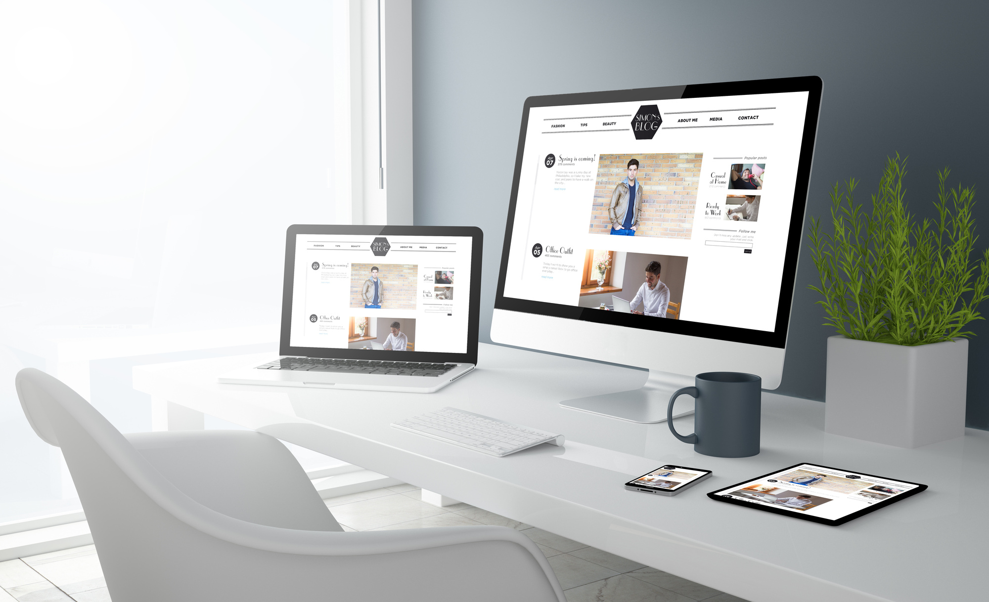
Likewise, you need to know your newsletter works on all mediums, from desktops to laptops to mobile devices. Check them out before releasing your newsletter into the wild so you know everything’s working as it should.
Email Newsletter Design That Works
This tutorial is the path to email newsletter design that actually works. It’s deceptive in its simplicity, but that’s the magic of it.
Keeping things simple is a better way to reach your audience in a complicated world.
Looking for some design advice? Why not take a look at our graphic design ideas?