


There’s a ridiculous amount of things to think about when you’re building a website. What template should I use? What’s the copy going to be about, what platform are you going to run it on, what browsers will it run on – the list goes on an on.
But perhaps the most important question is, what will it look like?
When it comes to looks, perhaps the most important thing to think about and choose is your website color scheme. But that can be a daunting task if you’re not the most color-coordinated of people out there.
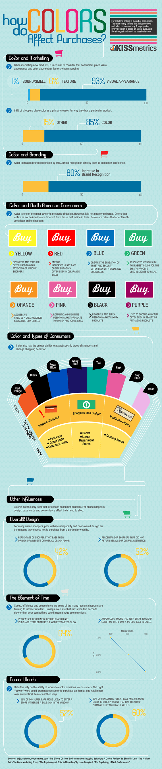
As it turns out, color not only just influences people to buy, it strongly influences them. Color is absolutely crucial to brand recognition. 85% of consumers list color as the main reason why they buy a product.
With that in mind, how do you get the colors you want? Where do you even start?
Here’s how.
Choosing a Website Color Scheme
There’s a lot of colors out there. And there’s a lot more to it than just picking your favorite color and being done with it.
Selecting a Dominant Color
You’re going to want to start with a main focus. This is called your dominant color.
The dominant color is what people think of when they think of the brand color. When they think of your brand, this is what people think of.
Do a little thinking about what you want people to associate with your brand. Different colors play on emotions differently. We’ve bundled them up here, but there’s a whole lot of color psychology all wrapped up into every color on the spectrum.
Pink, Light Blue, and Light Pink
When people look at these colors, they think of traditional values and a sense of nostalgia. Think Baskin Robbins, Mary Kay, or Pepto Bismol.
These colors are calm and delicate – if those are things you want associated with your website color scheme, consider using one of these shades.
Red, Black, and Blue
These bold colors attract bold shoppers – we’re looking at impulse buyers or people not too heavily concerned with a budget. These colors stand out and make a strong statement for your brand. Think of Chanel, Nike, or fast food chains.
Teal, Green, Navy Blue
These colors are associated with people who like to find a good bargain. General thriftiness, conscience, and good sense come to mind when people think of these colors. Consider stores and brands like Whole Foods, Starbucks, and Spotify.
Once you do some research and get a good grasp on what colors mean, you should take some time to reflect on what message your brand is trying to send if you haven’t already.
Think of the customer base you’re trying to attract and the product you’re selling. When you do nail down the color you’re looking for, use it sparingly on your website.
You’re going to want to use it in your logo, of course. From there, think of other key places to use the color that will attract the eye. You don’t want to oversaturate with the dominant color, but you want to make its presence known on the website to make your brand pop.
Selecting Your Accent Colors
Ok, if you can’t put your dominant color everywhere, what other colors should you use? The answer: your accent colors.
Accent colors help offset and complement whichever color you choose as your dominant color. They also accent other important parts or your website.
To find the colors that mix and match well with your main color, it’s going to take a little trial and error. Some colors blend well with certain colors, and others don’t.
If the idea of mixology scares you, don’t worry. You can use color matching tools to help you find your perfect accent colors.
The Adobe color wheel tool is particularly helpful when it comes to choosing color themes. It may look complicated, but it’s actually less intimidating than it seems, and you can use a tutorial to get acquainted with it.
If you want – it’s your website – you can go to town with accent colors, but it’s recommended that you select only one to two to make sure your focal point is on your product and your dominant color.
Find Your Background Color
You’re almost there. Now it’s just time to find your background color. The background color is, obviously, in the background – but it’s a very important choice for your website.
The most common background, as you can imagine, is white. This promotes a fresh, clean look. Neutral backgrounds also have the same look while bringing some depth into the equation.
When you have a bold brand color, think of using a light or neutral background to let that color do its thing and remain dominant. It will stand out against the light background.
If your brand color is on the lighter side, a darker background can really help to make the brand color pop. For instance, if you’ve chosen a tan shade as your brand color, adding a bold background like navy or black can make it stand out.
Color all has to do with what you want to make stand out – so if you’re highlighting your content, a rule of thumb is to put the color focus there. Let the colors guide people to what they’re buying.
Actually Make Your Website
Now that you know what kind of website color scheme you want to use, it’s time to get out there and actually make that website. When all the little pieces, like what color to use, come together, it makes creating the whole a lot easier.
But there’s still a lot to learn. Luckily, there are sites out there with entire blogs dedicated to web design. You can learn how to add widgets, what you should be charging and what you should be getting charged, and basically everything you need to know to get started.
Isn’t the internet great? Now there’s literally no reason for you not to get out there and make your dream website.