
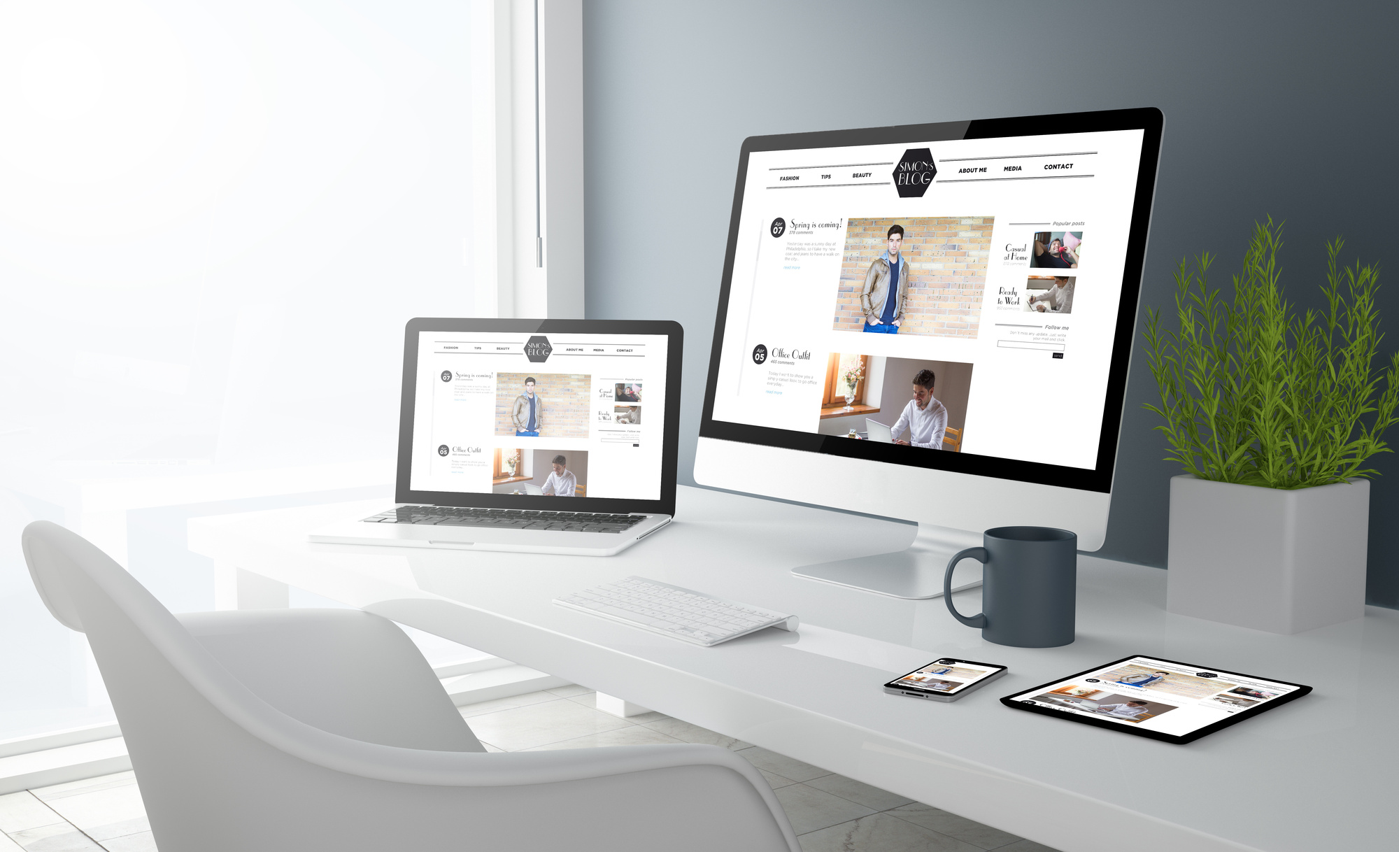


Did you know that your web design alone can keep visitors on your site?
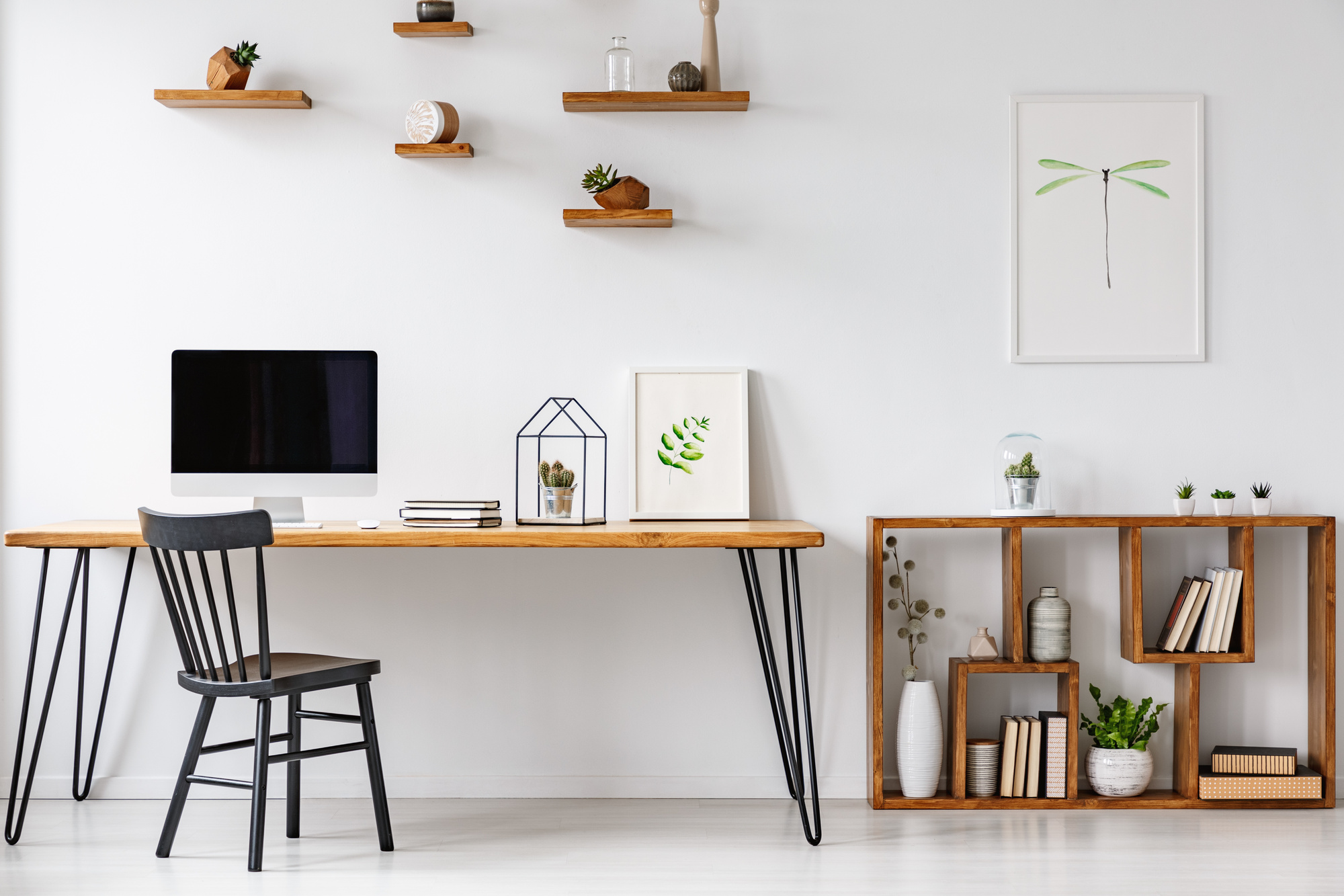
The idea that people judge books by their covers applies to websites, too. Visitors are more likely to stay on your site if it looks attractive and professional.
In fact, your web design can even sway purchase decisions!
One way that design can affect consumer behavior is through color. Different types of colors in your web design can actually function like miniature marketing tools.
In this post, we discuss the ways you can intelligently use color in your web design. Read on for insight!
1. Use Complementary Colors
Complementary colors refer to hues that are opposite each other on the color wheel. The color wheel assembles basic color hues in essential relationships.
Interior designers, artists, and designers often refer to the color wheel when selecting designs.
In layman’s terms, complementary colors quite simply look good together! And when it comes to design, colors that look good together are more likely to create an overall pleasing effect.
Keep in mind that complementary colors don’t mean strictly bright orange and primary blue. They can also be variants on complementary relationships.
For example, you can pair a steel blue with a rust orange for a classic complementary look. Visit this website for an example of complementary colors in action.
Use complementary color relationships when designing your pages, content, and themes.
2. Bring Color Theory into Your Logo
A logo is an essential part of your branding image. It gives consumers a quick, concise image of who you are.
Your website likely already includes your logo. Bring color theory into the picture by including different color variations of your logo.
For example, let’s say that your homepage has a classic black-and-white version of your logo. Uploading a cobalt or faded blue version of your logo on your blog page can give more versatility to your site.
It can also enable you to adapt your logo to each individual page’s design. This is vital if your theme changes from page to page.
3. Create an Atmosphere
Color has psychological associations, too. Staring at a bright yellow wall, for example, is likely to have an energizing, thrilling effect.
A pale blue wall, however, may soothe or induce feelings of calm.
Use color with your web design to create a site mood or atmosphere. Make sure this atmosphere resonates with your mission, service, or product.
For example, if you are advertising spa services, you may wish to opt for a color palette that creates a meditative or restorative atmosphere. Colors that support this mood include blues, whites, greens, and violets.
4. Make People Feel Good When Buying
Use the psychology of color to influence key stages of the conversion process.
Use colors likely to induce positive feelings when designing check-out pages, for example.
These include warm shades, such as yellow, red, and orange. Even a well-chosen shade of blue can create a positive vibe for customers making a purchase decision.
5. Don’t Forget Pop-Ups
Many sites use pop-ups. These are content marketing tools designed to guide visitors toward action of some kind.
A well-placed pop-up can go miles, especially if it offers a visitor a discount or incentive of some kind.
Make sure that you use color intelligently when designing your pop-ups.
A glaring red pop-up may actually dissuade a visitor, for example. A softer, white-and-blue pop-up, however, may have greater impact.
6. Use Accents Strategically
You don’t have to populate your site with bright strokes or orange or yellow. Using these brighter, energizing colors as strategic accents may be more effective.
Think of your site as a bare, white-walled room. Most designers aren’t apt to paint all of those walls cherry red–at least not with a solid intention.
They may, however, use bright accents, such as a crimson vase or a blue-and-orange rug. Strategic splashes of color can be pleasing to the eye, especially with neutral backgrounds.
Follow the same principles when crafting your site design. Consider establishing a neutral palette highlighted with brief, intentional flares of color.
7. Use a Consistent Palette
Whatever you do, make sure you maintain consistency. Your design should never feel sporadic or jarring. Such designs can quickly guide visitors away from your site.
Create a palette that applies to your entire site. (Just as designers select a color palette for an entire home.)
This won’t make your site look boring or monochrome. In fact, you can find infinite variations of hues and shades in a singular palette.
8. Go Monochrome
A monochrome color scheme can actually be very effective. Using different variations of the same color can be striking, especially for the right content.
Monochrome themes can also be professional. If you are in the finance industry, for example, a monochromatic theme can look seamless and authoritative.
If you do opt for monochrome, make sure you establish visual boundaries so that your pages don’t all seem to run together. These include line breaks, page headers, and bold font.
9. Don’t Forget Images
Edit your site’s photos to match the visual effect of your website. This doesn’t necessarily mean applying filters to all of your images.
It could mean, however, boosting certain saturation levels of the colors in your site palette. If your site follows an orange-and-blue palette, make sure the blue and orange in your photos are amped.
This will ensure that your images look seamless.
10. Change Things Up As Needed
It’s important to view color theory as a marketing tool. Once you’ve made changes to the color of your design, note how it influences site traffic and conversion rates.
Make any changes as needed. Often, this means spending more time identifying what you wish to convey–and how you want to greet your visitors.
Final Thoughts: Different Types of Colors
Color is more essential to site design than most marketers realize. But bringing color theory into your design goes beyond merely using different types of colors.
It may mean using color to establish a certain mood or atmosphere. Some designers make use of complementary color relationships when crafting a site palette.
Others guide purchase decisions with strategic use of color and accents.
At DesignsDesk, we are here to give you the design inspiration you crave. Eager for graphic design ideas? We have them here!