


Depending on who you ask, the IT field may have gotten started as early as the 1940s. But as modern computers evolved and became a way of life, IT evolved with them.
Today, IT is a crucial part of any successful business. While lots of brands still rely on an in-house IT department, it’s become more popular to outsource the work to an experienced, professional IT company. More IT companies have sprung up to meet this demand.
In this competitive field, how can you make sure a client will choose to work with you over the competitors? Minimalist web design can help.
In this guide, we’ll show you exactly why minimalism gets you more clients, and how to design a minimalist website that works for you. Keep reading to learn how to grow your IT client base!
Why Minimalist Web Design Matters
Minimalism has long been a web trend in certain industries. You probably associated these designs with the kinds of fashion and lifestyle websites that cater to the trendy millennial crowd. But what can minimalist websites do for the IT industry?
The answer has a lot to do with the way your industry is perceived. Many people see IT as a mysterious, complicated world. Some IT departments are notorious for struggling to communicate in laypeople’s terms.
A minimalist website helps set your brand apart from the IT stereotypes. By making your site clean, simple, and easy to look at, you’re suggesting that your company is also easy to work with. People turn to IT companies to help take the stress and confusion away. If looking at your website already helps them feel relaxed, that’s a good sign.
Minimalist Website Design Tips
Now that you know why minimalism is valuable, let’s discuss the tips to help you create a winning minimalist IT site. These ideas might sound simple, but they’ll make all the difference in how your company is perceived.
1. Consider Your Images
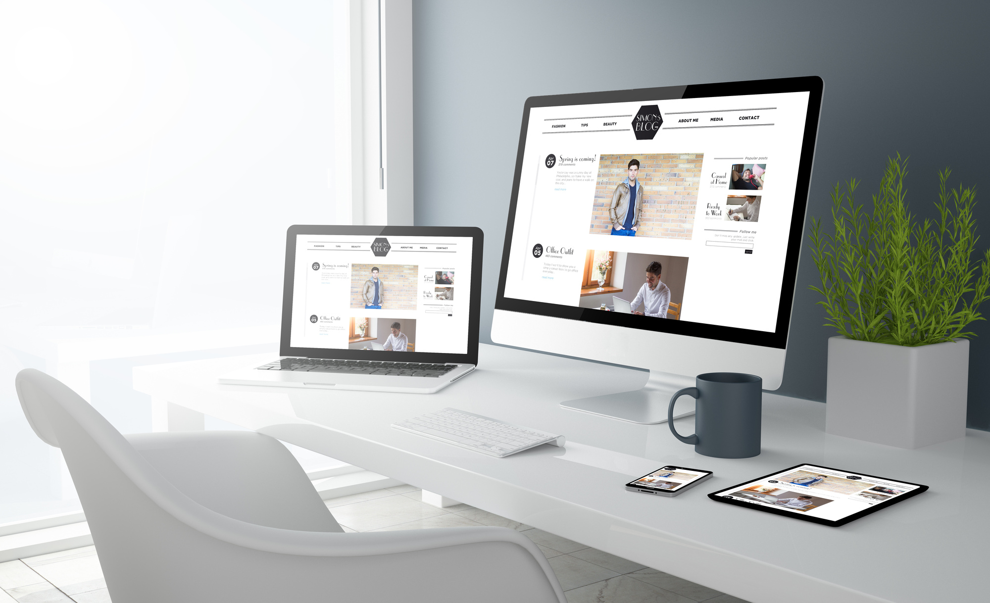
Although IT isn’t a looks-driven industry, a winning business website needs to have images. Incorporating minimalist concepts into your image strategy will help you get the clients you want.
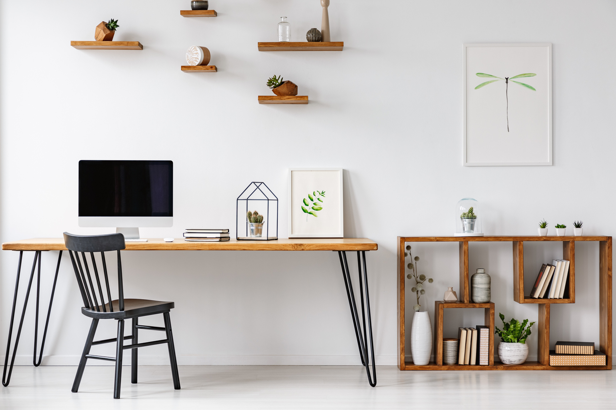
Your images should be soothing and simple. Avoid busy pictures, such as an image of a crowded office. Instead, you might show a clean, pretty desk with a laptop on it.
The images need to be related to what you do, but they don’t need to be directly related. Instead of showing IT at work, you can show the type of work situation that your clients aspire to: calm, yet productive.
You should also make sure your images fit with the overall look of your website. You’ll want to choose a color scheme and stick with that. The colors of your images don’t all have to match perfectly, but they should all blend with your site colors in some ways. Using more neutrals with just a few accent colors is always a good way to go.
Finally, no matter how nice the pictures are, don’t saturate your site with them. Even if the images have a minimalist design, showing too many at once will get tiring to look at.
2. Choose Your Colors
Let’s talk a little bit more about how to choose colors for a minimalist website.
Technically, no color is off-limits here. But if you want to use bright or saturated colors, you’ll want to use them sparingly, as accents. Most minimalist designs thrive with lighter colors or neutrals.
Think about what different colors make people feel. A faded teal seems earthy and gentle, like the ocean on a spring morning. Bright red, on the other hand, evokes stressful images like stoplights and sirens.
Black and white designs are another classic minimalist choice. However, take care to strike the right balance between minimal and boring. Monochrome can look nice, but a splash of accent color can help add visual interest.
3. Leave White Space
The best minimalist websites use plenty of white space. In fact, there might be more white space than actual content on the page.
This helps keep the eye from getting overwhelmed by too many options, words, or images. Your goal is to get rid of everything that’s not absolutely necessary on each page. That way, the essential elements can shine.
Technically, “white space” might not actually be white: the backdrop of your site could be a different color. But it’s important that the space is empty, free of patterns and other distractions.
When someone looks at a page with plenty of blank space, they can immediately see the information they want. This makes your company look straightforward and easy to work with. Clients are less likely to navigate to your competitor’s sites if your site doesn’t overwhelm them.
4. Select Fonts with Care
Too many different fonts, or fonts that are too fancy, can also harm your site’s image.
For a minimalist site, a sans-serif font is always your best bet. These modern fonts don’t have any extra flourishes or decor. They’re easy to look at, and they convey a sense of chic competence that many people associate with their favorite tech brands.
Try to use no more than two or three fonts on your whole site. Have a set font strategy: for example, one font for headers and a different one for text. Avoid unusual or creative-looking fonts — stick with something that’s simple and not distracting.
5. Hide Your Navigation
If every navigation option is visible on your homepage, it can add to the sense of stress and clutter.
Hiding your navigation options, such as by using a drop-down “menu” bar, is a great way to give people the option to navigate while keeping the homepage clean.
Make sure your navigation buttons are sleek and clear, too. Use simple commands like “Home” or “About Us.” Avoid clunky navigation tools like naked URLs (a naked URL looks like this: https://www.charlotteitsolutions.com/whats-the-difference-between-ransomware-and-malware/).
Ready to Design Your Minimalist Website?
Using minimalist web design in IT is simple. Just follow these best practices, find some websites you love for inspiration, and start designing. Soon, you’ll see new clients flow in.
Looking for more inspiration for your IT company website? Don’t miss these hot design trends of the year!