


Your website’s design can have a major impact on your business. About 38% of your site’s visitors will leave your website if it has a bad design or it’s not usable.
That’s 38% of visitors that you won’t have a chance to tell your business story and sell products and services to, all because of your website’s design.
How can you make your site user-friendly so you can increase conversions and get more revenue for your business? Check out these usability principles to find out.
1. Make It Mobile
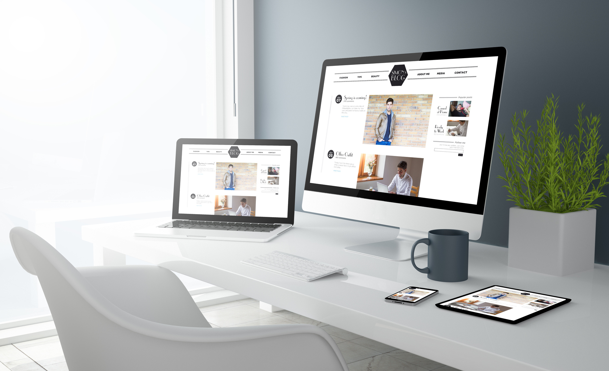
Mobile friendliness or responsiveness are two website terms that you’ll need to know and understand. Your site’s visitors will use many different types of devices to get to your site, there are Android phones, iPhones, tablets, and desktop computers.
You can make sure that your design is responsive, which means that the design will respond to the device’s screen size. Mobile friendly just means that it works on mobile devices.
Using a WordPress Designer like Coventry Web Design would guide you in this basic usability principle.
2. Get Rid of Clutter
One of the big usability principles of web design is to have a “clean” web design. What does that mean? It means get rid of clutter.
A navigation menu that has too many pages can turn off users. A home page that has too many images that slow down the site’s usability will have an impact, too.
3. Make Your Site Scannable
You want your site’s design to match how people look at websites today. They don’t read a ton of content.
They’ll scan headlines and headings to learn what your content is about. They tend to see a website in an F-shaped pattern. They’ll look at the top left corner first and then scan down the article.
From a design and content perspective, the most important information has to be at the top and be strong enough to hold the visitor’s attention. Adding images to pages with a lot of text can help break up this pattern.
4. Draw the Eye to the Most Important Elements
Knowing how people scan websites across devices is useful. One way you can avoid the common F-shaped scanning issue is by using whitespace.
Whitespace is a usability principle that designers can use too often or too little. There’s a delicate balance between the two. You want to use whitespace to draw attention to a certain element or image on a page.
Usability Principles for More Conversions
You do a lot to get visitors to your website. You invest in digital marketing strategies like blog posts, SEO, and social media.
Yet, if your site isn’t usable, then you’re giving your site’s visitors a reason to leave your site before they learn about what you have to offer.
Implementing these usability principles can make a big difference in how your company is perceived by users and can increase your sales.
Want more top design tips? Check out the rest of our blog today.