


Before one initiates the process of creating a webpage, they should start with defining the design for responsive web design.
However, many websites still neglect this important faculty of the web experience.
In this article, we will cover what responsive web design is, and why it matters.
Keep reading to learn the defining responsive web design faculties.
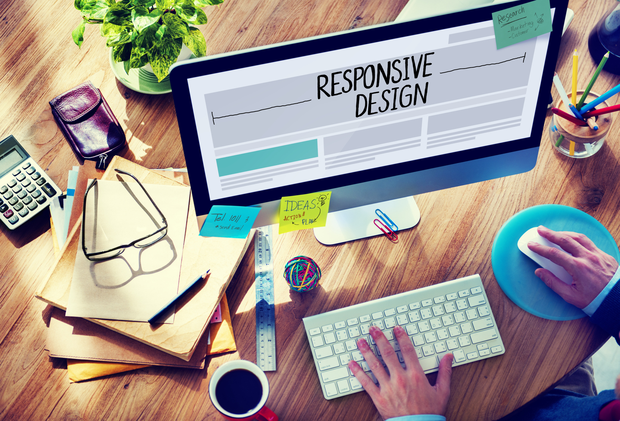
What Is Responsive Web Design?
Responsive web design is the result of a process that designs a website with mobile-friendly features in mind, such as media, content, and layout. A responsive website adapts to the viewport of a device, including desktops, tablets, smartphones, etc.
Responsive is no longer an add-on, but a critical requirement to build brand awareness, diversify the experience, and convert more leads.
It also saves a lot of time. Instead of having various websites for each device – they can all visit the same site and enjoy a unique experience. Responsive ensures compatibility will all devices and ensures a positive experience.
So let’s take a look at why responsive web design is important.
Why Is Responsive Web Design Important?
As mentioned earlier, through responsive design, you can reach a broader and engaged audience, no matter what medium of access they choose.
And a lack of responsibility does exactly the opposite—it separates the customer from your brand, and you can lose a significant chunk of your customers due to this liability.
That’s a lot of revenue.
Now let’s take a look at defining responsive web design practices.
The Benefits of Responsive Web Design
Like most things in life, responsive web design does come with benefits. Let’s take an involved look at the most prominent advantages of having a responsive design.
Discovery
Google traffic primarily comes from mobile devices. In fact, Google penalizes websites that don’t have responsive design. Mobile-first indexing impacts your rankings and can cause it to get bumped down in SERP.
So if your audience is searching for you on a smartphone, and your website doesn’t have a responsive design—a customer might not find your website at all.
Engagement
Bounce rates on smartphones are increasingly alarming. A web page that loads in five seconds or less are guaranteed to get more engagement than one that loads longer.
A mobile user expects quick and quality website experiences, so you have to meet the expectations of both the user and Google to make sure you are hitting the requirements.
Brand Awareness
A client will not recommend a business with a poorly-designed mobile website. Online shoppers are going to think negatively about your business, if your online presences are less than cared for.
A responsive web design delights your clients and encourages them to spread awareness, and that’s an important faculty for those who need to drive more sales.
Defining Responsive Design Practices
Through the use of an intuitive CMS and the services of a Calgary Web Design company, you will be able to attain responsive design in no time. Let’s talk about some defining responsive design practices that a company will help you create to encourage a mobile-friendly experience for your customers.
Value of Buttons
When a visitor lands on your website, what do you want them to do? Take action, right?
This can be done via a simple call-to-action, such as a Learn More, Buy, Download, or Contact Us button.
How the visitor will interact with the button your site will differ from how it will look on mobile, so the button has to be appropriately scaled and placed for both experiences.
For instance, if you have a CTA at the top of your desktop site when you view the mobile site, the button won’t fit in the header. So instead of removing it, you can include it in the hamburger menu or move it to the bottom.
In addition, the size will vary, as a cursor has less margin of error than a finger on a small screen.
In general, a clickable element on mobile should at least be 48 pixels high. This includes menu navigation, inline links, form field, and buttons.
Scalable Vector Graphics & Images
If your website holds a lot of icons or illustrations, it should be uploaded in the format of an SVG. An SVG can be infinitely scaled, unlike a JPG or PNG. This ensures that no matter the viewing experience; the image retains the quality in its fullest form.
Not to mention, they load faster which is important for positive user experience and SERP rankings.
Having the images is only the first step. You have to make sure that they scale with viewport changes. For instance, a desktop image might be at 1200 pixels, whereas on mobile it would only need 400 pixels.
Using a large resolution on mobile slows down the page speed. Instead you can upload different resolutions and designate which will load on each device. This is done via media tags that are local to source objects.
Typography
A font that looks great on a desktop might not look as good on a mobile device. If a visitor can’t read the text, they certainly won’t buy or click on anything.
But if you structure the reading experience based on mobile viewports, the desktop experience will dwindle.
The best approach to typography lies in:
- A 16pt font type
- Avoiding thing fonts that fade away on mobile screens
- Headings are clear and larger than body or subheadings
- Contrasting colors for fonts, so they don’t fade
However, typography can be done in any shape or form, as long as it is responsive.
Device Features
Make use of mobile features. A desktop user can’t call you on their computer, but they can with their phone. Consider changing CTAs such as “Chat Now!” to “Call Now!” and include an actionable redirect to phone, instead of an email.
In addition to that, if you have a mobile app, you can prompt them to open the app from the website.
Test Often
Testing your web design regularly is important for keeping everything responsive. Check the Google Mobile-Friendly Test tool to see how you perform.
Web Design Done Right
Now that you have discovered the defining responsive design features, you are well on your way to knowing that not-responsive design is lack of design by design.
If you’re neglecting the importance of responsive web design, you are neglecting the value of your business.
If you’re interested in learning more about websites, check out some of our other blogs.