


Already, a majority of internet users rely on their smartphones for their online fix. By 2025, this percentage will swell to an estimated 72.6%.
The bottom line is this: A functional mobile website is no longer cutting-edge technology. It’s an expectation.
Now you may be asking yourself, “how do I make my website look the same on mobile?” After all, your website design plays a huge role in the success of your conversions, marketing campaigns, and social media interconnectivity.
If you want a mobile-friendly website, you may not be asking the right question. Let’s take a look at the current state of mobile website design and what you can do to impress your mobile visitors.
How Do I Make My Website Look the Same on Mobile?
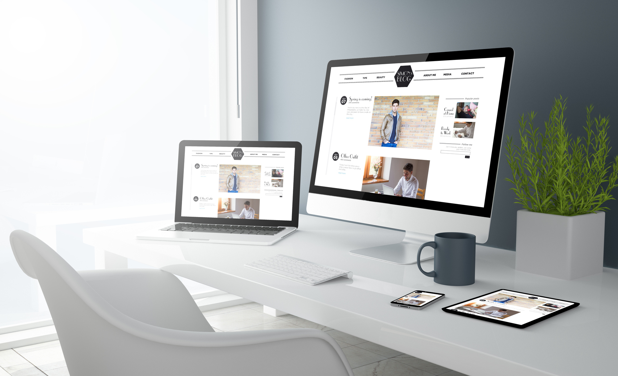
First, you should know that there are some significant differences between desktop and mobile users. Consider the monitor size, for example. Smartphones have significantly less space to work with, so using the same website design can have unintended consequences.
There are two types of mobile web design: responsive and adaptive. Responsive websites scale features to more clearly reflect the desktop version. That’s because they adjust according to the visitor’s display monitor.
That’s about as close as you should get to copying your existing desktop website to a mobile format. Responsive mobile websites have become the new standard since they’re easier to implement and don’t deviate too far from your well-designed desktop website.
In contrast, adaptive web design creates entirely different layouts depending on the device. That means your desktop, mobile, and tablet websites wouldn’t look similar.
Designing a Mobile Website
Okay, so you want a responsive mobile website. How do you make it happen?
There’s no single method. But depending on your budget and personal needs, there’s a developer or tool right for you. Let’s cover the most popular options.
Use a Responsive Template
If you’re using a content management system like WordPress, you’re in luck. Third-party content creators publish a host of different templates and themes, all at various price points. These essentially function as the skeleton of your website, contributing to both its format and aesthetic.
Since you have a desktop website you’d like to preserve, you should see if your current template is already responsive. To do so, visit the template page for more information. If you downloaded this template from the official WordPress website, just search for the “responsive layout” tag.
Not using a responsive layout? You may be able to make things work without dramatically altering your current website. If you’re not attached to the current web design, now’s a good time to switch to a responsive, mobile-friendly theme. There are so many templates to choose from that your best bet is the check for those with the best ratings.
Try a Mobile Plugin
If you’re a WordPress user without a responsive template, a mobile plugin can help. A plugin is like a small app built into your website, offering features you didn’t have before. You’re probably already using dozens of plugins at this very moment.
A mobile plugin can convert your existing desktop website into a beautiful mobile version. WPtouch is the most popular. The mobile theme will deviate somewhat, but the bulk of your website will stay the same.
Although WPtouch has a free version, it limits your customization options. Depending on your current website, you may find that you need to pay for the full thing for the best results.
Rely on the Professionals
So far, we’ve only covered websites powered by WordPress. What about those with custom websites or even WordPress users looking for something better tailored to their needs?
If you aren’t a skilled web developer, it’s time to reach out to someone who can design your website. You can either work with a freelancer from a site like Upwork or go through a web design agency.
While a freelancer will likely be cheaper than a full agency, they tend to be less reliable. After all, it’s one developer versus an entire corporation.
The good news is, creating a responsive version of an existing mobile website isn’t that time-consuming. And that means your mobile site will carry a smaller price tag than your initial website ever did.
Still, it’s best not to be stingy. Great mobile website design can be the difference between a 2% conversion rate and a .02% conversion rate.
AMP It Up
Making a mobile website that fits your company aesthetic shouldn’t be your only goal. In addition to looking great, the mobile version needs to run great too.
No matter how you complete the conversion, it may be worthwhile to AMP it up with accelerated mobile pages. Originally created by Google, this framework can speed up the loading time of your mobile website.
And that means everything when most smartphone visitors aren’t willing to wait more than a few seconds for your website to load. Google also prioritizes websites with fast loading speeds, offering a massive SEO boost that could place you on the first page of the SERPs.
The World Is Going Mobile
And you should too. As more internet users rely on mobile devices, companies without mobile websites — or those with bad ones — could suffer the consequences a few years down the line.
“How do I make my website look the same on mobile?” While it’s not as easy as pressing a button, it can be close to it. Give WordPress plugins and themes a whirl, or get in touch with your web developer to make a custom mobile solution.
If you want to learn about mobile website design, you’ve come to the right place. Beautify your world with the help of our site’s design coverage.