


What’s in a website design?
Sure it’s good to look pretty. But the cold facts are that you’ll be sacrificing customers — and money — if you don’t step it up when it comes to good design.
In fact, 79% of people who don’t like what they see on a site will go find another one to look at.
What’re you doing to keep them on yours?
This year, gradients are so in. They’re being used to hold user’s attention and create a desirable aesthetic.
Here are seven stellar gradient examples you can incorporate them in your web design.
What are Gradient Examples?
Gradients are a fade of color from one to another. The gradual blending of two colors allows the designer to almost create a new color entirely.
They create a depth that can’t be paralleled by a flat color.
Just like anything in design, gradients can be overdone. Here are some suggestions on how to implement them in a stunning, classy way.
- Use two colors. Definitely not more than three.
- Use gradients sparingly to draw in attention.
- Choose complimenting colors.
- Play with opacity.
- Use linear gradients for square or other polygonal shapes.
- Use radial gradients for round areas in designs.
Above are some of the best practices for gradients. Now let’s talk about some gradient examples you can incorporate into your web design.
Why are Gradients Back In?
This trend has been catch-phrased as ‘Gradient 2.0’ in 2018. And for good reason — It’s making a serious comeback.
But why now?
Color, in general, is being used in a whole new way in web design this year. Think about Dropbox and their release of their multi-colored logos without changing the design.
Things are getting bolder, too. And we don’t just mean with typography.
Web designers are exploring bolder color. Gone are the days of boring blues and comfortable greens.
As the world develops and younger generations continue to seek fresh experiences, designers keep pace.
Gradients are a great example of this trend. It’s like shoulder pads making a comeback but in a brand new way — Old fashion done contemporary.
They’re not being used everywhere like they were a few years ago. Gradients are now playing a behind the scenes role to add depth and character to design.
Gradients are being used to set the mood, catch the eye, and create visuals in a way that hasn’t been done before.
So what are some gradient examples you can use to do the same? Read on to find our top picks.
1. Header Gradients
Nothing catches the eye more than a gradient right when someone lands on your site. Rather than a typical photo or flat color, gradients can create an amazing first impression.
You can do this by using a gradient overlay. Or you can simply have a gradient background behind your text.
2. Call-to-Actions
Gradients can be a great tool to draw the eye away from other elements on a site.
This makes them one of the best website design tools for calls to action.
You can do this in a few ways.
- Make the text on a button have a gradient.
- Design the button background as a gradient.
- Make the button border a gradient.
You can even use a design such as an arrow to point to the CTA and have a gradient on the arrow!
Get creative here. But when used in this way, don’t use gradients anywhere else.
Make it a clear, memorable signal that it’s a call-to-action.
3. Logo
A lot of companies are hopping on the bandwagon when it comes to using a gradient logo design.
When done correctly, it’s a great way to create a memorable brand.
Logo gradient examples include brands like Instagram and Bashooka.
4. Text Effects
Gradient designs are a useful text effect.
Have a particular header you want to make sure gets read? You can switch it up to have a beautiful, eye-catching gradient.
The gradient itself can work from top to bottom or left to right. Keep in mind where you’d like to lead the viewer’s eyes.
For example, if you have a button underneath a gradient header, you could have the color go from top to bottom.
This is a great technique to get people engaging with your content the way you want!
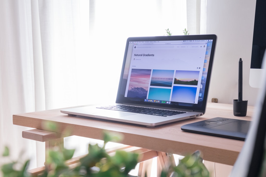
5. Images
Images can have a unique feel by adding a gradient to them.
The image itself can fade into 100% color. Or you can use a gradient overlay to create a different look and help text pop.
A mix between the two is also possible. Use an overlay for half the image and have it fade into a solid color.
No matter what you choose, this is an interesting technique that isn’t being used. This is the way to go if you’re looking to use gradients in a very trendy way.
6. Bold Contrast
A lot of gradient examples are toned down and use a light, gradual fade.
But if you really want to pop, try a bold contrast.
You will still want to use colors that look good together. But they can be in very different families.
For example, you could fade from a deep blue to a turquoise. The dark to the light creates a highly contrasting, but still beautiful, gradient design.
7. Website Background
It’s a bold statement. But you can have your entire website background as one big gradient.
As your reader explores you can use the gradient as part of your story. This is a great way to set the scene for all your content.
Too much?
Try certain sections of your site. Rather than alternating between flat colored backgrounds for each section, use a flat color for some sections and gradients for others.
Daring Design Next Steps
Web design is about more than ‘looking pretty’… it’s about making money.
In fact, Bing reportedly increased revenue by $80 million by choosing the right hue of blue for their web design!
These gradient examples are a great way to use design to create a memorable experience for your online customers.
Want more amazing insights? Check out these graphic design ideas to constantly stay fresh in the ever-evolving online world.