


Did you know that 40% of Americans buy items online several times a month? Because of this fact, retail e-commerce sales are set to double before 2020! It’s safe to say that online shopping isn’t going anywhere.
If you own or operate a furniture business, then you know how huge these numbers are. Almost half of the population uses the Internet to determine value and make purchasing decisions. Your website can’t afford to underwhelm!
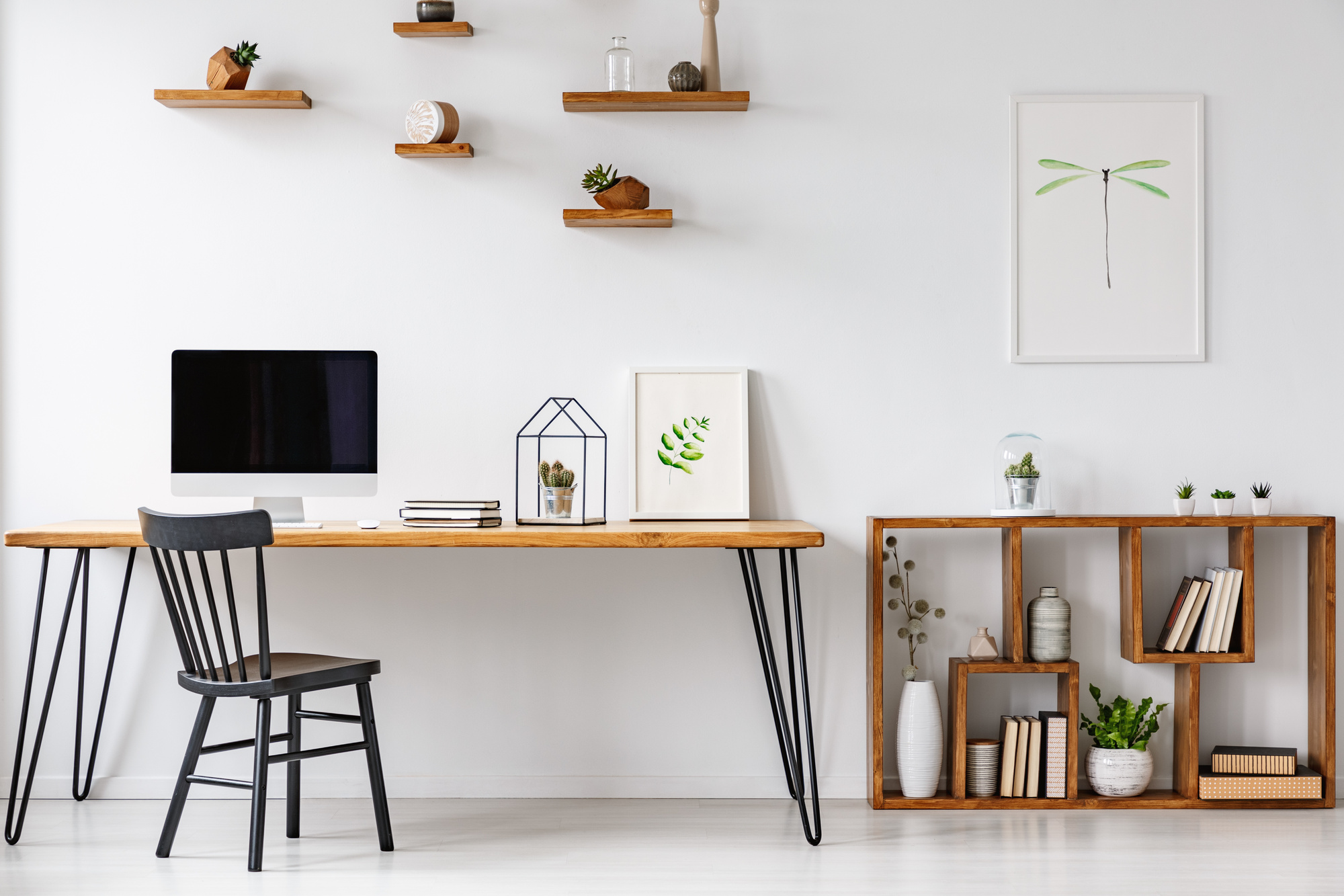
Fear not – there’s plenty of inspiration to go around. Furniture website design is as important as storefront design. If you want to increase your sales and reach, a quality web page is where it’s at.
And, by the way, you have 10 seconds to make your design count. Otherwise, a potential customer is moving on to an easier, more aesthetically-pleasing page.
So sit down in a comfy lounge chair and gather ideas from some of our favorite furniture sites!
1. Sleek & Transparent
These are two words that come to mind when perusing the BluDot Design & Manufacturing site.
Upon entering the homepage, a “Join Our Newsletter” pop-up greets the browser. This is essential to keeping people in touch with your current sales, trends, and more. Consider adding one of these to your page as a way to improve communication.
A navigable toolbar at the top of the page directs browsers to different areas of the home. Click on a section, and you’ll notice below each product an “Available in (#) finishes” mention. This makes it easier for a customer to understand their options.
2. Custom & Cool
Fancy Homes is an Australian furniture website dedicated to producing custom furniture. One awesome tool they use? A price filter.
Let’s say a customer is shopping for leather lounge suites. The left side of that page allows them to choose their price range. This makes the shopping process easier. Buyers won’t have to click each lounge chair before getting disappointed in the price tag.
3. Bright & Visual
Furniture website Lulu and Georgia know that a picture speaks a thousand words. Their website is bright, with a calming white background, and full of imagery.
After all, furniture websites are selling an aesthetic product. What better way to highlight the beauty than letting photos speak?
L and G’s homepage immerses browsers immediately into well-done, bright-lit pictures. They feature their cleverly-designed furniture, from thick rugs to a “Best Of.”
Consider adding a “Bestsellers” section to your page, as well. This tells buyers you’re producing quality items that others are dying to get their hands on.
L and G also has a “Get $50” button on the left side of their homepage. Click the icon and a pop-up informs you of a referral service that they offer. Consider adding a special discount on your homepage to entice people to stay there and spend!
Furniture Website Design: An Essential Aesthetic
Your furniture needs to be pleasing to the eye and easy to navigate. And so does your furniture website design. Don’t skimp on this important part of building a base of loyal customers!
So you’ve got design ideas. Now, what about the color scheme? Check out our article on how to choose the best colors for your high-traffic webpage!